Summer Group Show 2021
TEXT BY MICHAELA MULLIN | VIEW IMAGES
August in Iowa is known for its humidity, high temperatures, State Fair crowds, and long lines for food on a stick. We at Moberg Gallery know, however, that summer in Iowa also means a gathering of favorite artists, exhibited together in one (new) space. The Iowa State Fair is back this year, and so is the gallery, happy to show Summer Group Show 2021, where some lines are long, some short, some contoured, and some broken. This re-emergence (of openings, in person exhibits, and time spent in front of the actual art, not the art on screen) holds work by a wonderfully motley and magnificent crew of Moberg artists you may know: Andrew Abbott, Heather Brammeier, Johanne Brouilette, Tibi Chelcea, David Dahlquist, Sarah Grant, Frank Hansen Alyson Khan, Bart Vargas, Robert Schulte Jr, Daniela Schweinsberg, Aaron Wilson & Time Dooley, Larassa Kabel, , Scott Charles Ross, and Dennis Wojkiewicz; as well as new-to-Moberg artists: William Downs, Kathranne Knight, and Alexandre Shiffer.
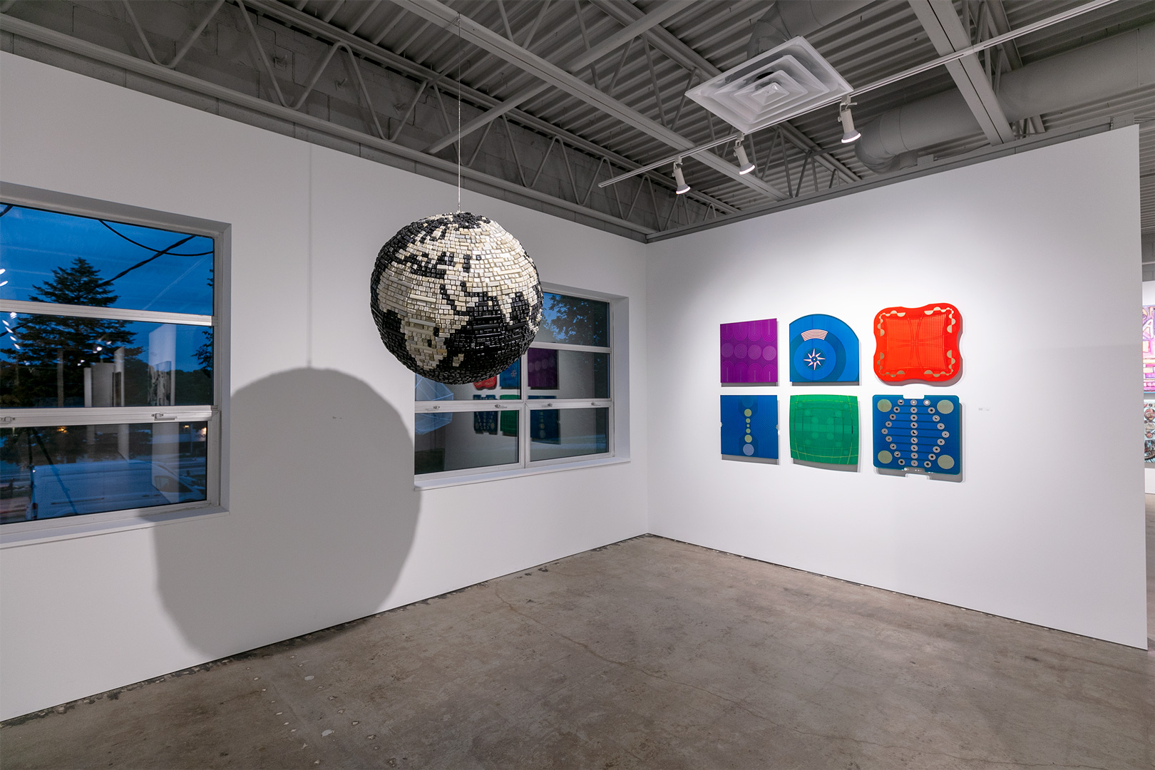
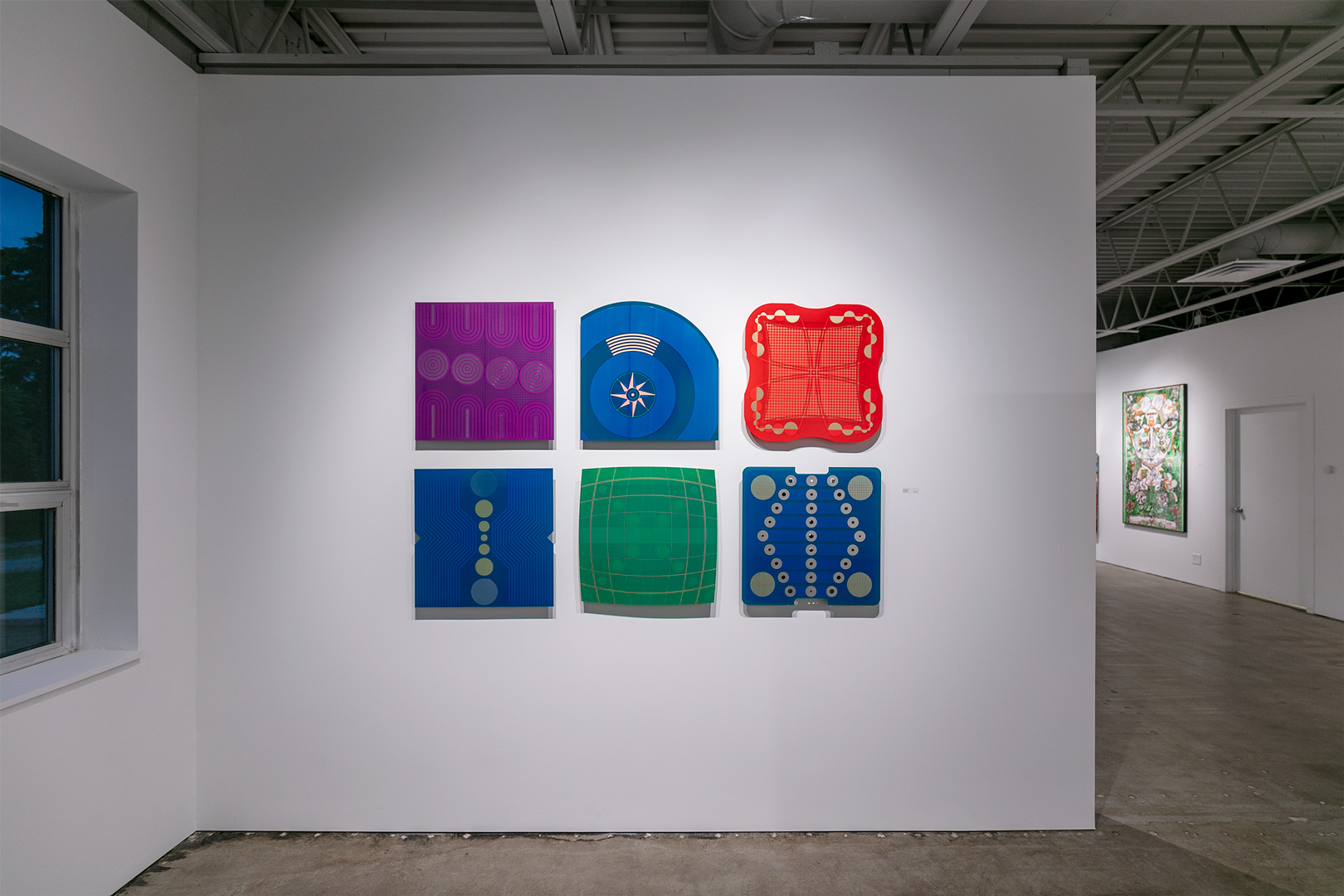
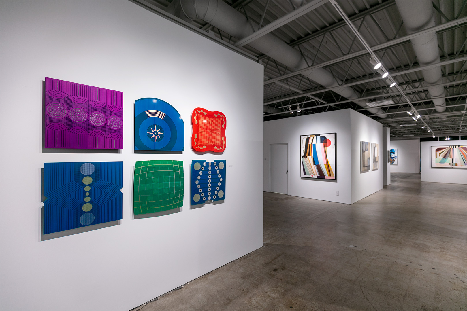
The new “PBC Drawings” (printed circuit boards) of Tibi Chelcea are slightly larger than many of his previous boards. These object/works are techno-segments of color, copper, and laminate. The patterning that exists in each one is so perfectly balanced and distinct that one might get drawn into a math imaginary (or is it?). The operations behind these become mesmerizingly repetitive and glossily opaque; they become the circuitry to an operation that only the eyes and mind can dream but should not need to compute otherwise. The way Chelcea devises shape is like constantly moving data toward the center, despite the aggregate nature of lines and space, circles and curves.
Alexandre Shiffer’s two large-scale paintings, “Star Gazing at Sunrise” and “Up and Away,” are studies of the cumulative, in acrylic on canvas. His work is born of a love of texture and color; he is influenced by ’80s street art, as well as the paintings of Edward Hopper and other artists who use light and shadow as main subjects. Though his figures here emerge of black lines, Shiffer’s colors shift in waves throughout and across the bodies like a wash of light through a prism. And every now and again, the viewer can catch the glimpse of a gap—an opening where the piling is not quite contiguous. Shiffer’s is a very populated world, a world that can be satirized as easily as tragedized—and in his own visual languages, babel is completely embraced.
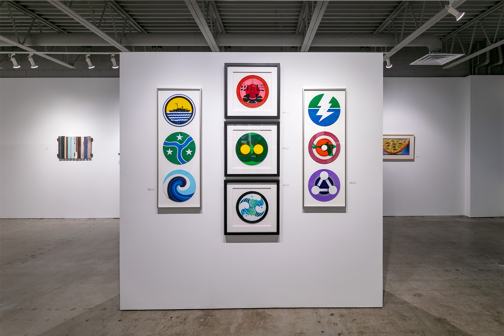
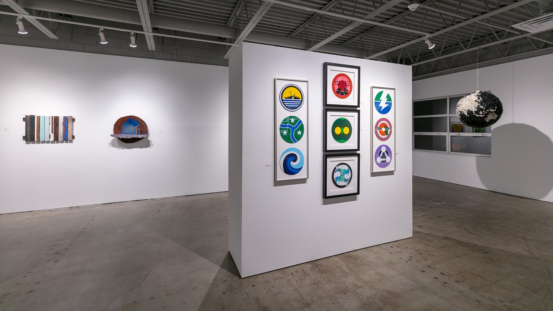
Robert Schulte, Jr. sees the world in its constituent parts. He uses fragments in his collage works and mixed-media vinyl records, and in doing so becomes a gestaltist, a maker of unexpected wholes. His vinyl record mixed-media works are small scenes contained in a circle–poems of nature, the art historical, pop cultural and more, often using the spindle hole to integrate into the image or to offer a punctum that adds a new question. Schulte draws from any fertile source, tightening the surplus of our visual frame, but not down to a detail, not magnified or miniaturized, but by using form and color that make evocative connections, he gets at an essential feeling.
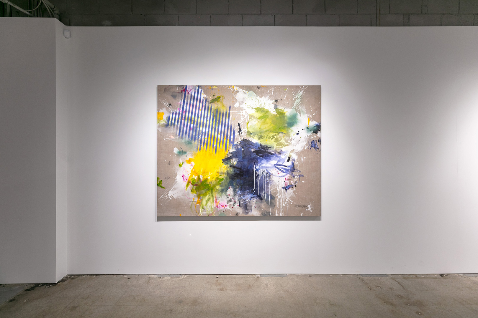
Daniela Schweinsberg “Love and Other Colors” smashes the expectation for contrast; this large-scale acrylic painting on canvas is layered and methodically shifted in gesture and application. The pink that identifies itself with its red and white showing is not “cute” but is primal and cosmological, like a Marilyn Minter work without the representational behind it. “Smells Like Spring” is a contained explosion penetrating or erupting from a gray background. The very parallel and uniform blue stripes in the upper left offset the spectacular splattering, building up, and dripping that comprise most of the composition.
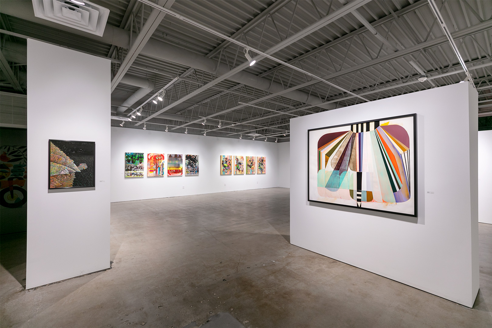
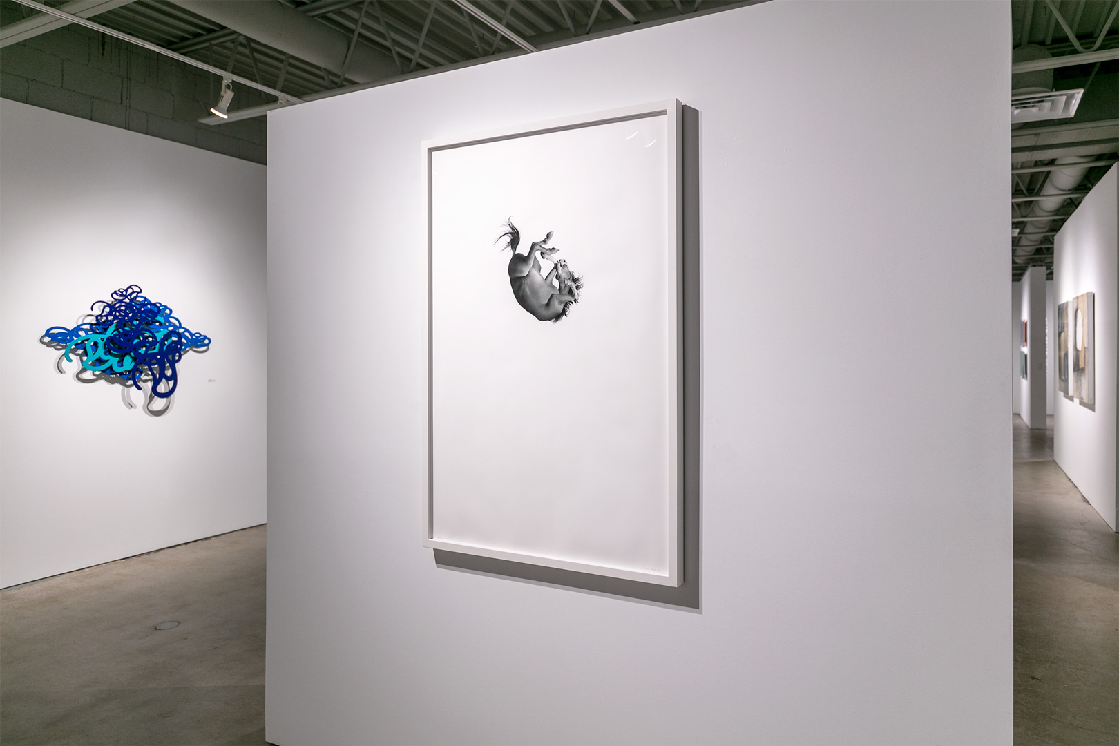
Larassa Kabel’s “The Favorite Son” is the newest in her ongoing series, Any Minute Now. This photo-realistic drawing in colored pencil on paper imagines a horse, presumably falling; its curling, as if in a fetal dive, is made more intense by the white space that holds (or tries to hold) it. On paper, as in the air, Kabel’s horse here is quiet, almost relaxed into the wind it makes with gravity. Her strokes and building of grays and light are perfected in the directional motion of the central figure; one might even see it held up awkwardly by an invisible presence, a large hand perhaps. This seemingly submissive depiction of such a strong and regal animal out of control, not even right-side up, compels both curiosity and compassion. It is the temporal ‘duration’ that Kabel captures best, however—any minute now, the prodigal may return—to earth.
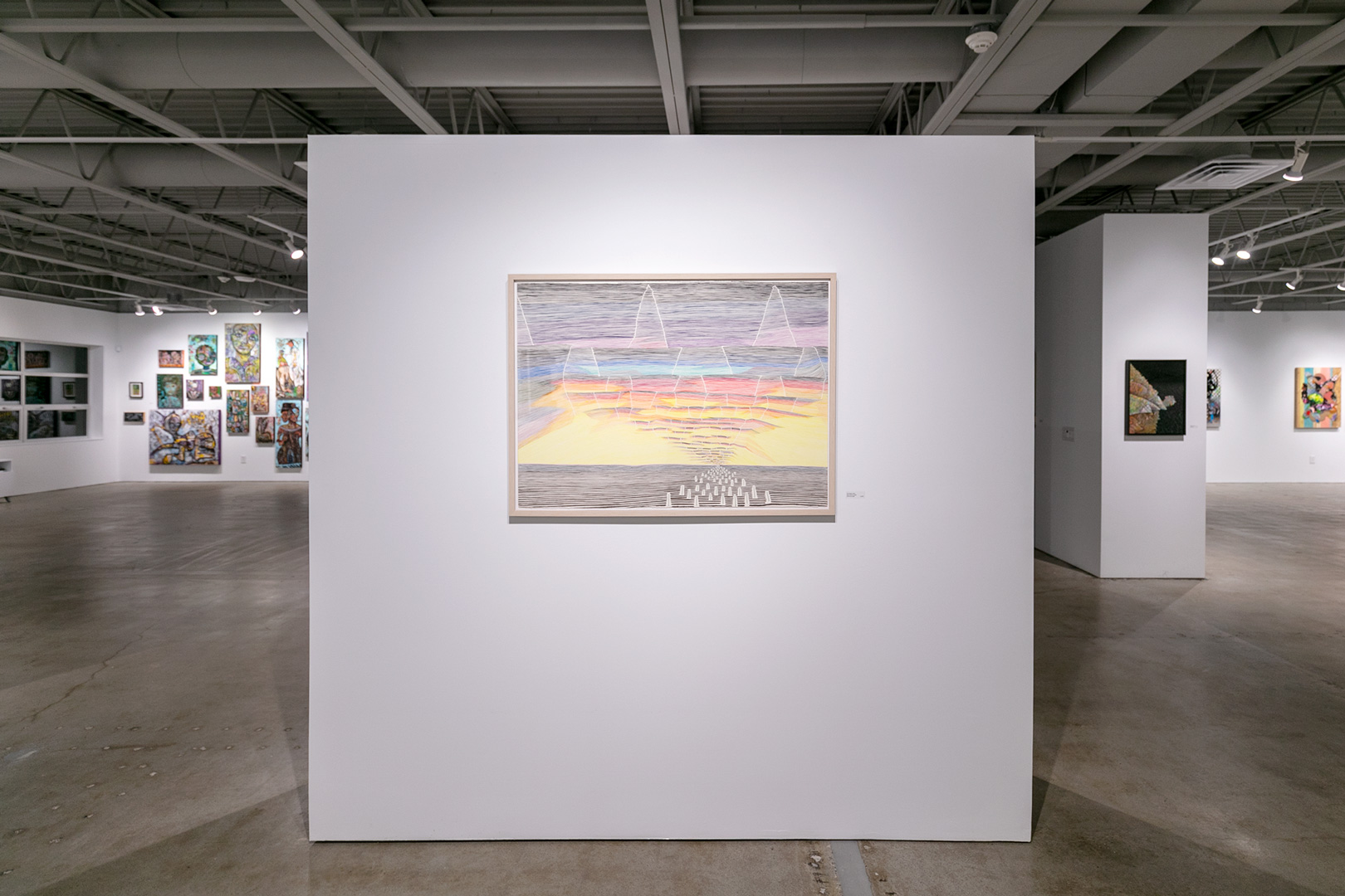
Kathranne Knight’s works on paper are “drawings [that] speak in the packed way of a symbol, often stripped down and elemental, but ricocheting with associations and metaphoric possibilities.” This line drawing, “The Distant Yellow,” in colored pencil, speaks out toward a horizon, which is future, which is that which we want but cannot see. Yet. Knight’s lines are obsessive and create shape where they stop—a moment where the line breaks become the smallest part of a cloud. The longest thread of color becomes the eye’s path to a little void on the paper. Using horizontal, vertical, and diagonal, the vanishing point is reached by jagged movements and small marks, hashing it out until the world it’s making curves just so, until its atmosphere hints at the sphere itself.
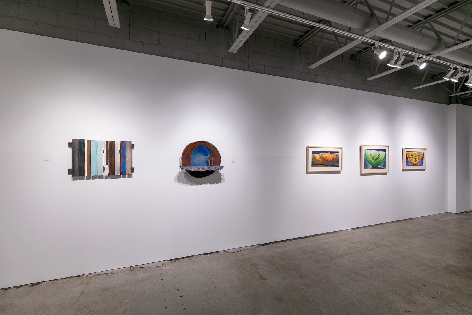
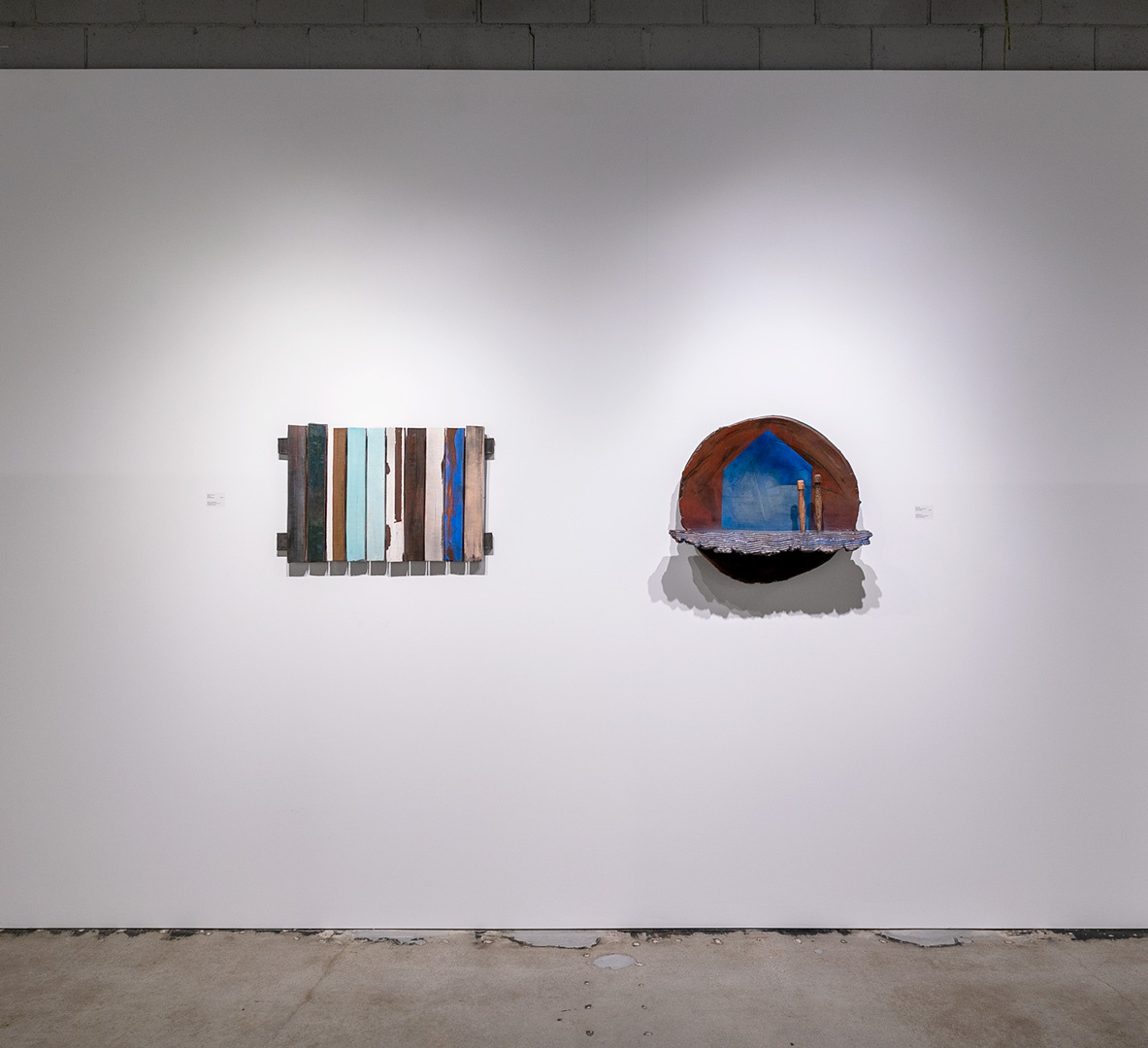
“State Fair Fence” and “Tent Pegs” are David Dahlquist’s new ceramic works, simple sculptures, referring their vibrant blues to the clear sky of summer. Like the haiku that accompany each one, these wall pieces are poetic and of the hearth. The fence and a house, and outside, are found objects that help pitch shelter. These invite calm, invite one into calm and quiet. Dahlquist forms quiet splendor in the malleable, that it may become structural and sound.
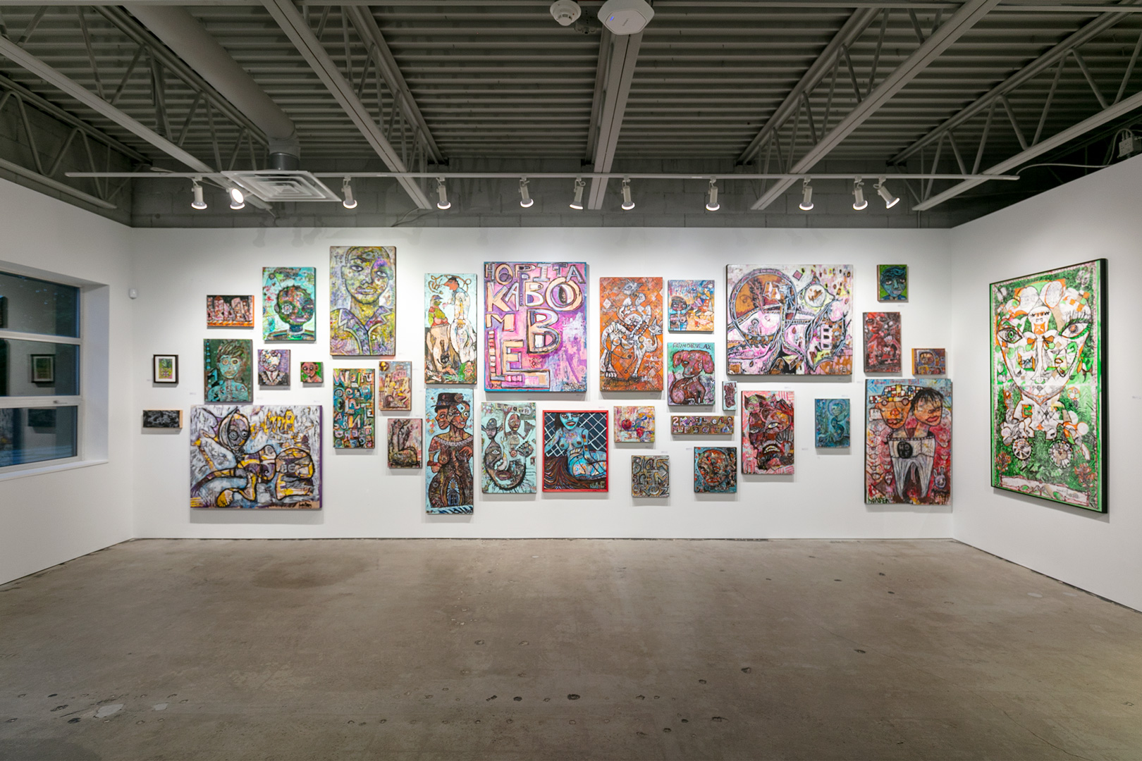
Frank Hansen’s salon wall covers much thematic, gestural and historical ground. Take, for instance, the mixed-media painting, “Quixote Has Left the Building,” which pulls from Spanish literature, walks the line between hope and insanity, and mixes it with Elvis’ (semi)permanent departure from this planet. Hansen’s tour de force in this exhibit, however, is not mixed media on panel but a large-scale work on paper, “Honkietta.” The work is tall, and Honkietta herself hovers both ominously and beneficently, like fortune in Tarot. This work is slightly less full than most of Hansen’s pieces; here he focuses on green, orange, and black. He also takes the chance to show the negative space of the paper, and so white becomes more prominent, light more dominant. His work is full of marks, full of life and action. Hansen is a colorist who loves black; he is a figurative artist that loves to abstract. He makes fantastical other worlds–parallel, perpendicular, curved, and outside of time—still moments in an ongoing story of science, as well as fiction, in an independent world.
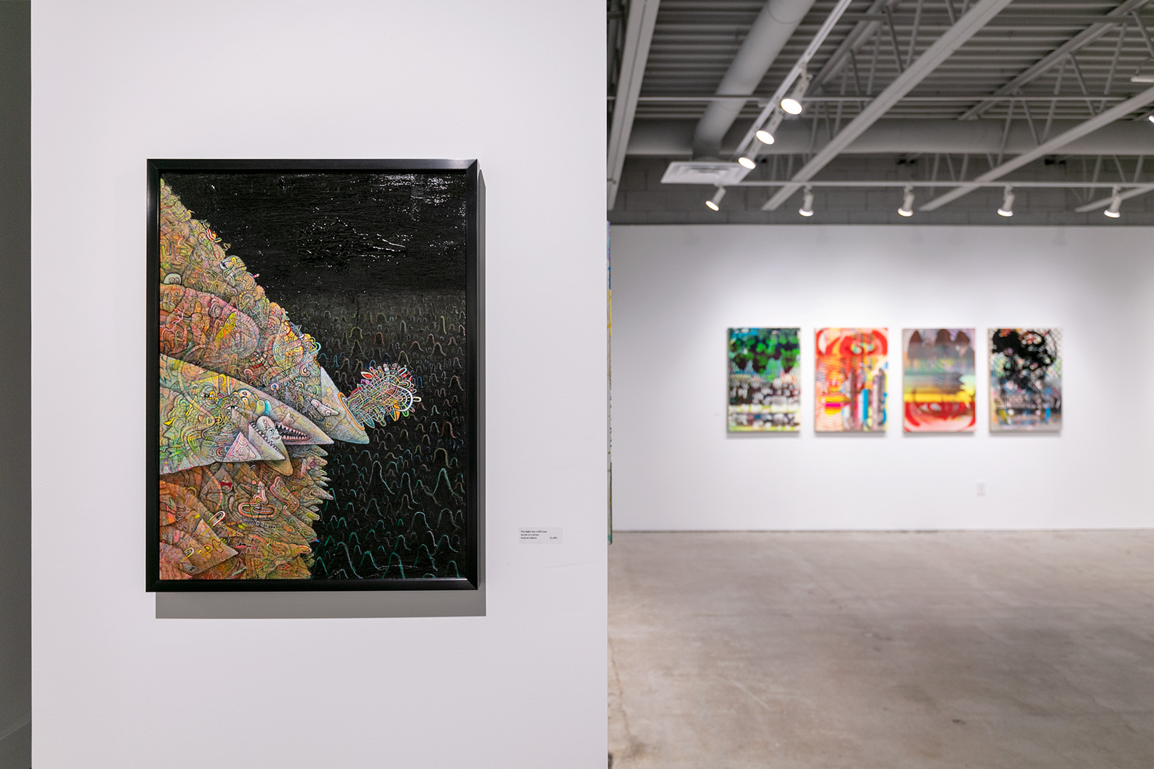
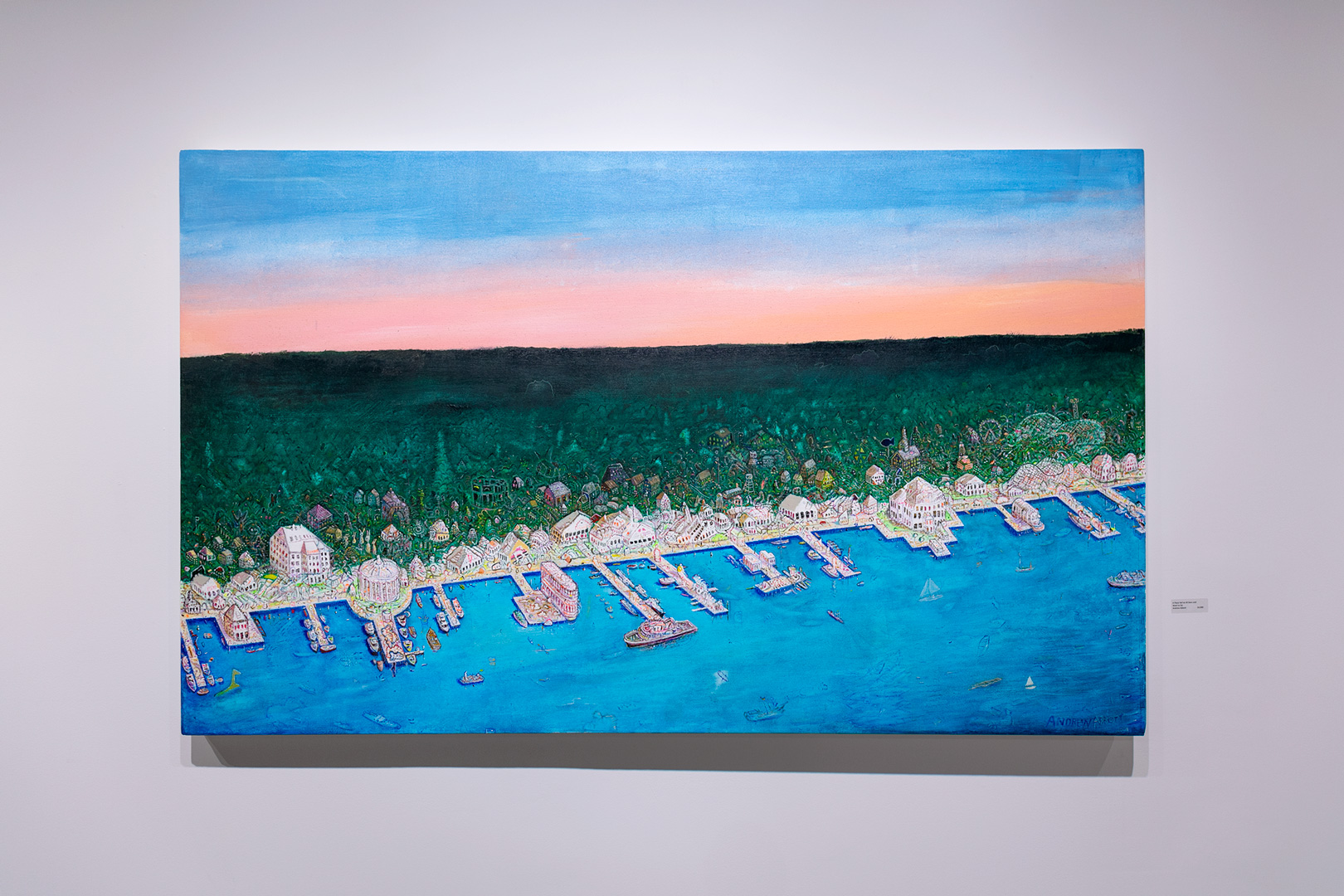
As if Hieronymus Bosch, Keith Haring, and Marcel Dzama got together to brainstorm and collaborate in the contemporary world —that’s how one might sometimes feel standing in front of an Andrew Abbott painting. Abbott continues to awe with his new dense land, space, and mystery-place-scapes, “Billion Acres,” “A Place We’ve All Seen and Want to Go,” and “The Night Has 1,000 Eyes.” These are surreal and narrative; so busy with surprise one could stand in front of one work for hours, still focusing to determine if some form is a daub, a dot, a body, a house, a boat, a bird, a plane, or a dinosaur. The coastal and the horizon become boundaries for spaces that offer surface shelter for Abbott’s prolification.
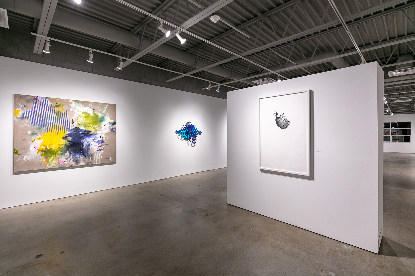
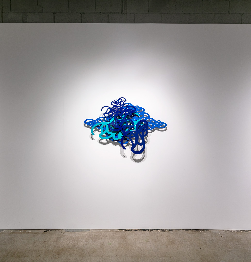
Heather Brammeier creates “Knot Collage,” in powder-coated steel, using 3-D lines that are layered and stacked, to intimate a beautiful entanglement of blues—dark to light, enabling the discernment of each thread that was entwined. In doing this, Brammeier also offers the viewer a possibility of understanding the unknotting that would explain or tell the very story of this work’s creation.
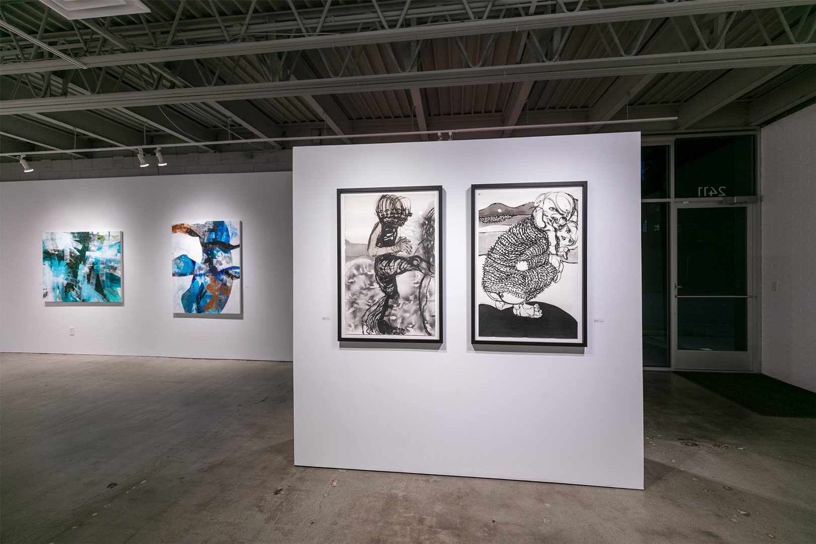
William Downs’ “Standing Next to a Mountain” and “Grumpy,” both ink wash on paper, are stark, visceral works of humans in emotion. His works exude the automatic nature of his practice, which portray behaviors as much as physicality. The barbed clothing and background patch in “Grumpy” evoke chains, and the position of Downs’ figures are almost always looking out, making eye contact with the viewer/witness/implicated.
New works by Sarah Grant are in black and white, with very small moments of color—which is the inverse of how Grant has worked for years. “At the Table” and “I Made It to the Top” are stories of Grant’s time during COVID-19 with her grandchild. Using activities surrounding school and play, this colorist has found a new way to express the stunning pathos and joy in a world that is not always vibrant and optimistic. The composition in “At the Table,” for instance, suggests an interior scene with people and objects, and very small exterior scenes in the background—distant, in outline only.
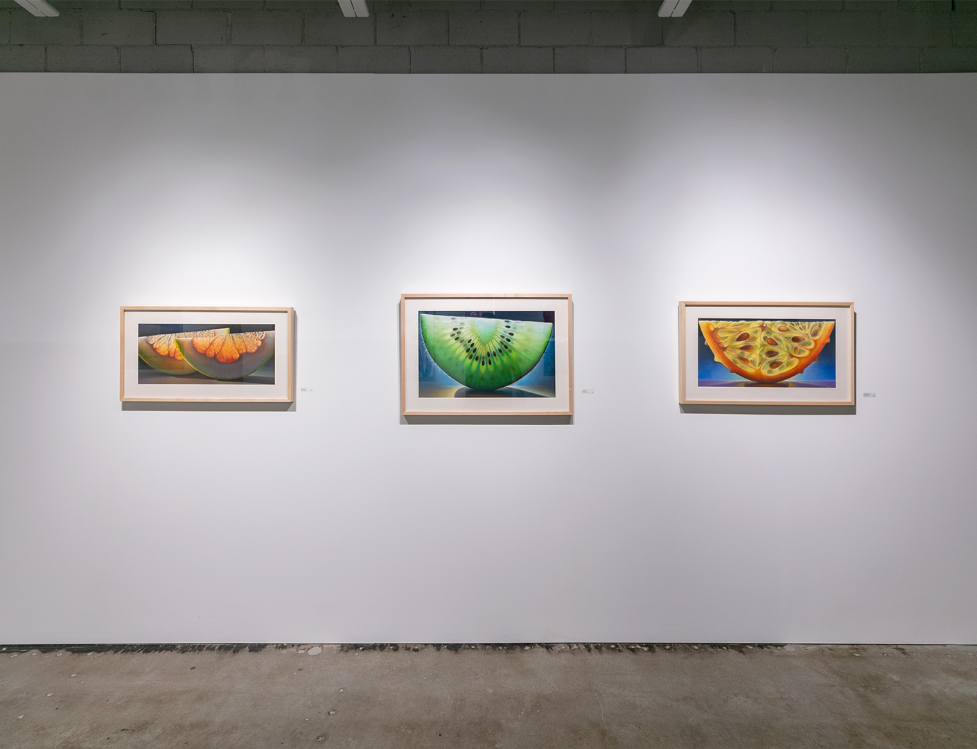
Dennis Wojkiewicz has three works in the exhibit: “Citrus Series #32,” “Horn Melon #6,” and “Kiwi Series #8.” As with fruit itself, the smaller the pastel paintings on paper, the sweeter. Unlike Wojkiewicz’ larger oil paintings, these works are more translucent and appear closer to still lifes than portraits. The atmosphere around and beneath each segment of fruit feels more tangible, a more concentrated taste when visually imbibed.
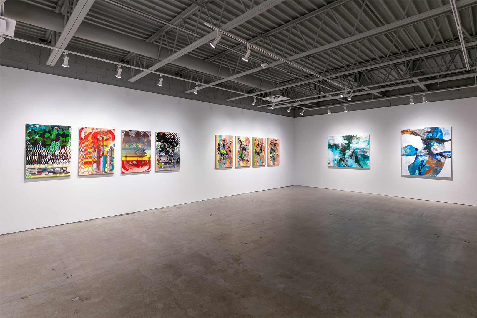
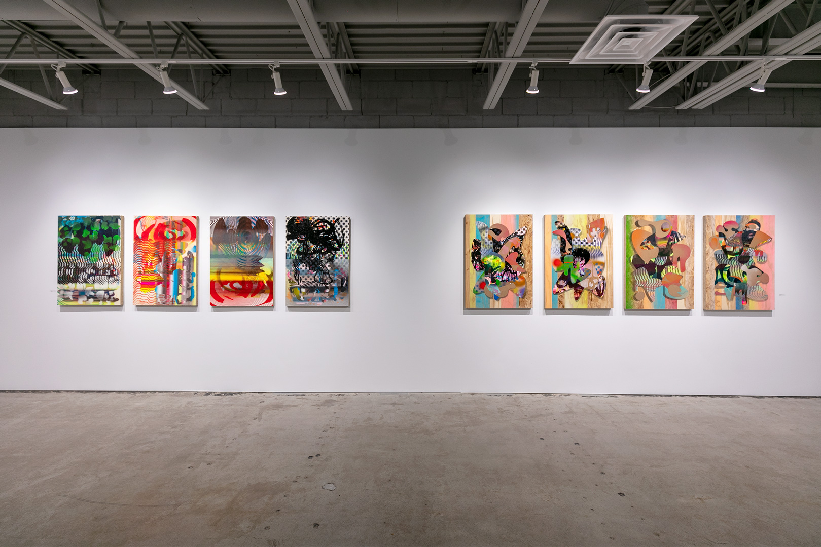
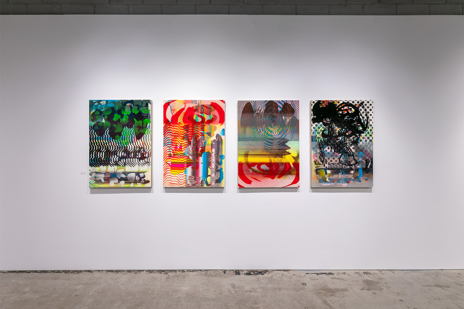
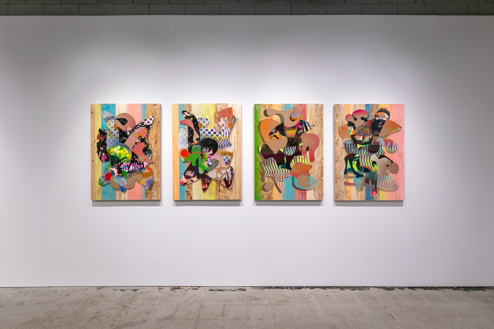
Exhibiting two series of four monoprints, Aaron Wilson & Tim Dooley, are the psychedelics of the show. “Pop Punk #1, #2, #3, #4” and “Sonic #1, #2, #3, #4” are the synesthetic works of the show—supplying a soundtrack. The “Sonic” panels are more saturated with paint/reverb; and the “Pop Punk” panels focus on the cut-out parts, which expose the panel wood in its inherent mixed-media appearance. Using the substrate as media and part of the ‘drawing’ renders the foreground louder but maintains balanced audio/visuals.
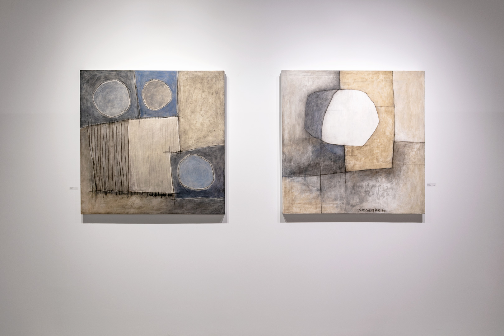
Scott Charles Ross’ three paintings, “Insight,” “Rhapsody in Blue,” and “Rhapsody in Red” are expressionistic maps, allowing for navigation of the mind. Using circles and squares, none of them striving for perfection, Ross shadows and flattens as the work demands, using complementary colors and monochromatic palettes to induce location and grant meditative experiences.
Alyson Khan’s prints hang in geometric philosophy. Included among the nine, are “Holding Water” and “The Courtesy of Filaments.” As if on a balcony, in or outside, the most modern of homes, Khan’s abstracts become floorplans for the viewer–best views in the house, an eye to the pool and a staircase illuminated. The organic shapes all nestle within and beside each other, and thus a graphic and hued harmony is struck, which structurally holds these compositions.
Two large-scale works Johanne Brouillette conjure Greek gods. “Phaunos” and “Gaia,” mixed media paintings, speak of the mother of nature and the house itself (earth) of which she is matriarch. The former is an incredible blur of paint strokes that operate almost as if one is looking down, through the clouds, to the forest; the aeriality affords us a long view, where the volume of paint makes it difficult to discern applications (trees).
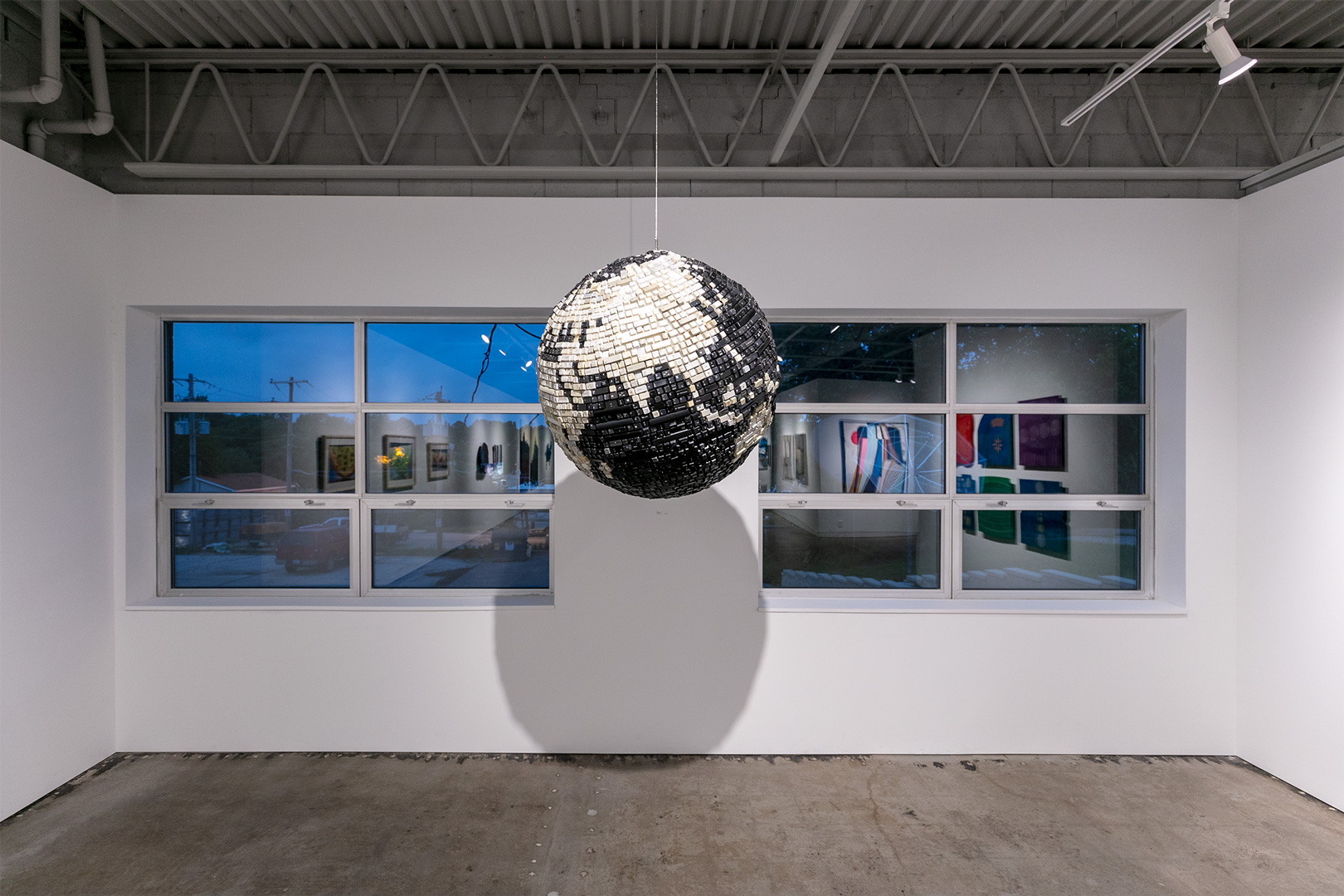
Bart Vargas’ “Globe” is exactly what the title says it is. Created from the keys of many keyboards, Vargas has ingeniously constructed a quite-accurate model of our global connectivity by using the means through which we “connect.” That it is in black and white (or gray, cream, beige), while out of availability most likely, also gives the world’s binary concerns (with very slight areas of grayscale) some light. It hangs like a pinata or disco ball, and the numbers, letters, and symbols on the keys are visible, granting a sense of constant computation though no communication can be transmitted. It’s now truly a small world, after all, when rerouting can make signal stops all over the world, when A to B is no longer preferable or safe. Vargas’ analog sphere reminds us that we still have to touch, to participate, that we are the keystrokes and code keys.
Exhibit Images