TEXT BY MICHAELA MULLIN | VIEW IMAGES
Language disguises thought.
-Ludwig Wittgenstein
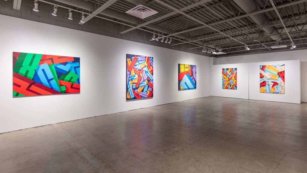
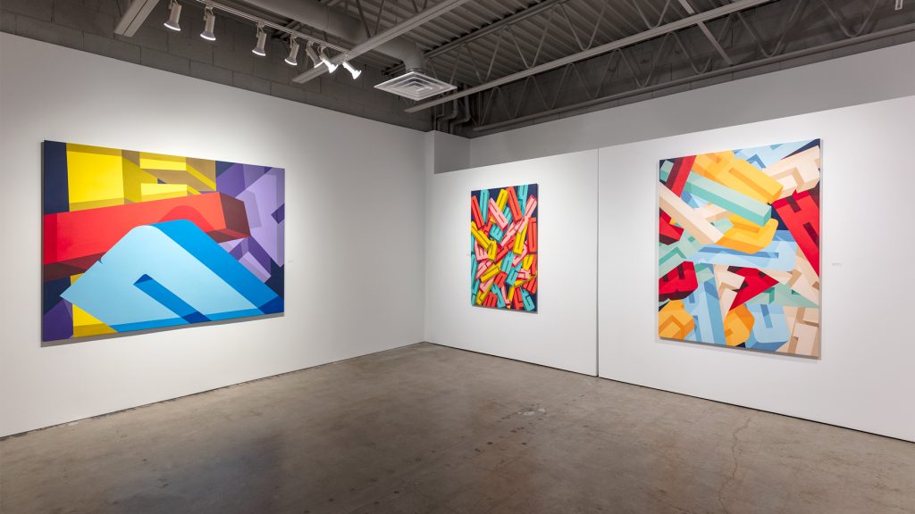
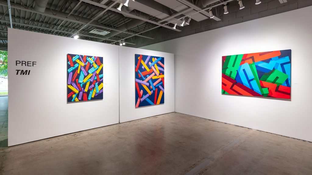
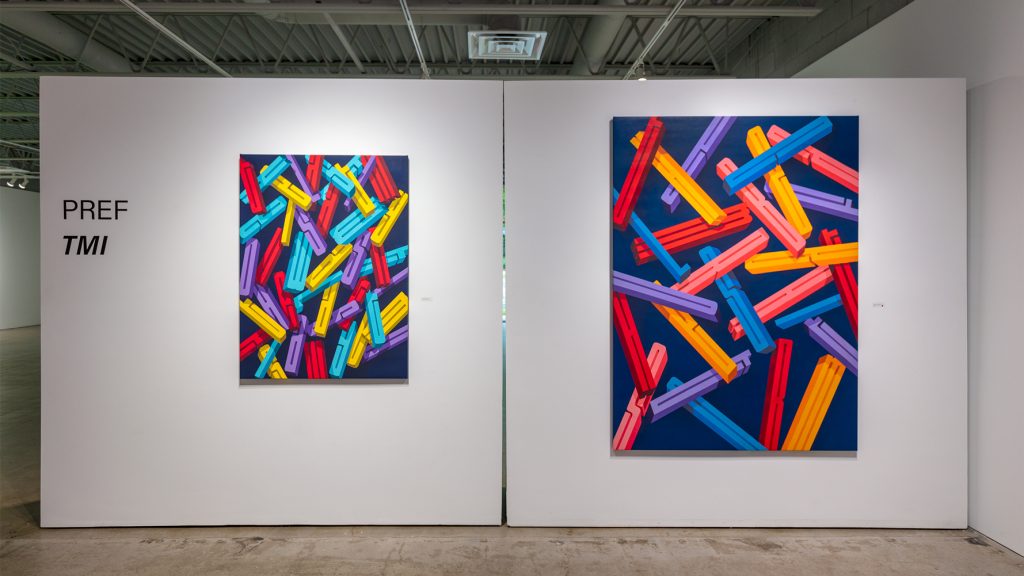
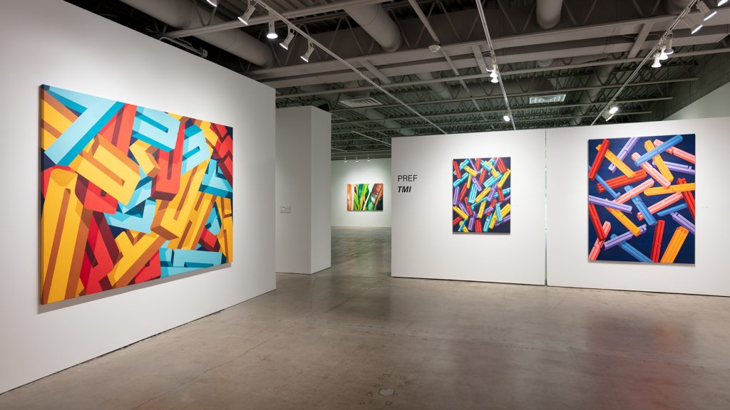
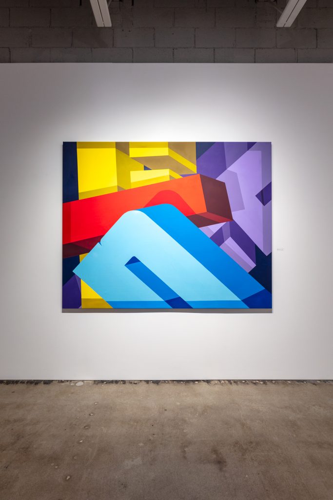
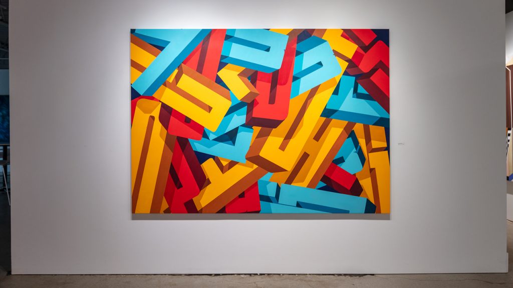
PREF is well known for his multi-layered fine art graffiti writing. His work is often described as typographic, and understandably so; however, Pref is more interested in being looser than that, and has found over the years that he wants to move on from single words or phrases that present as visual puzzles and start shining a light on letters themselves.
It became clear to him during the pandemic how much work letters were doing to communicate to the world constantly, and he wanted to let them have fun and take some pressure off from all the frightening updates. He wants “to upset the world of typography” by creating type with “no style.” These new works have more human energy, Pref says, and his exploration of texture within the letters and sentences that “fall and crumble” also represents the onslaught of information in this modern age.
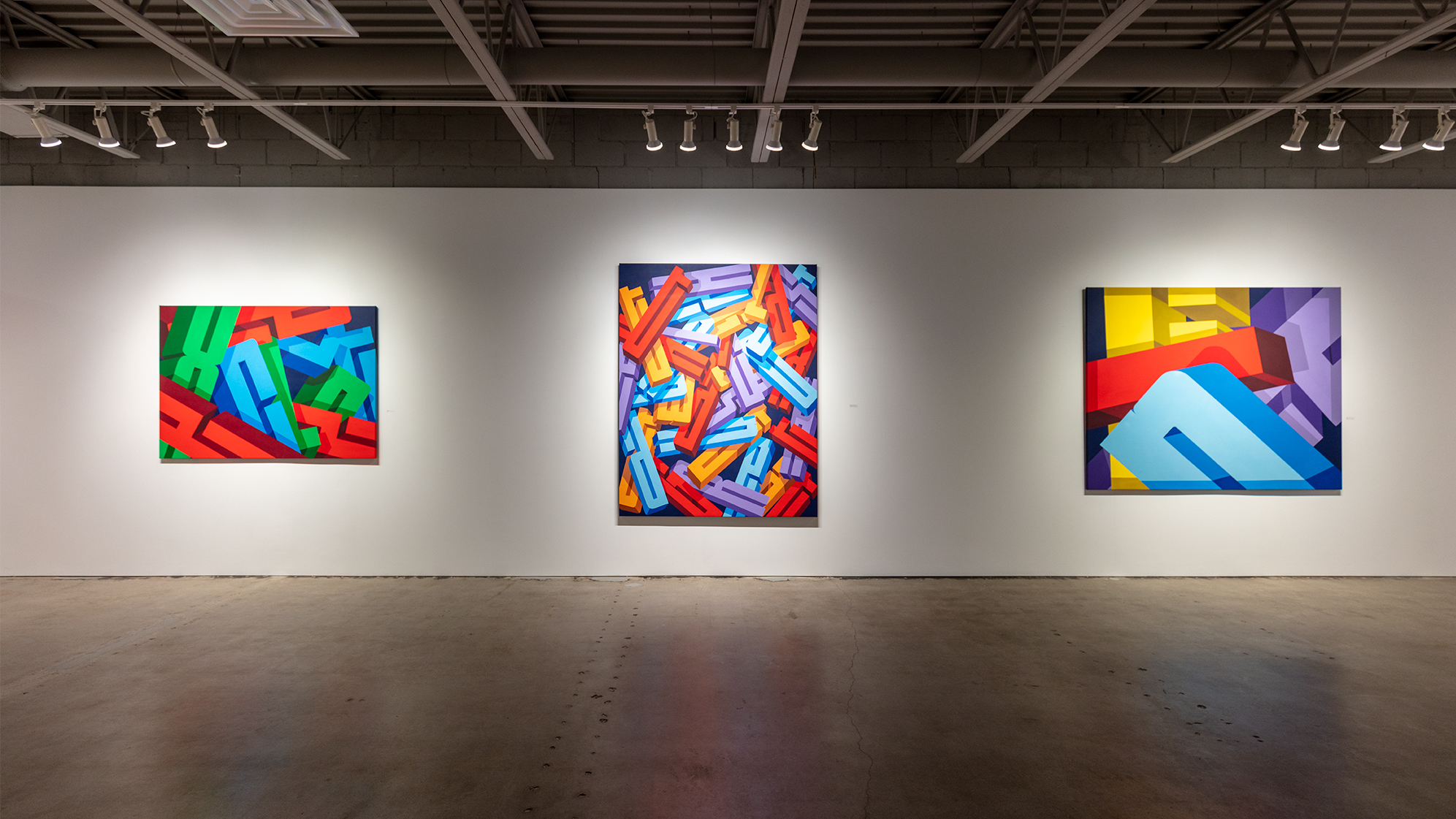
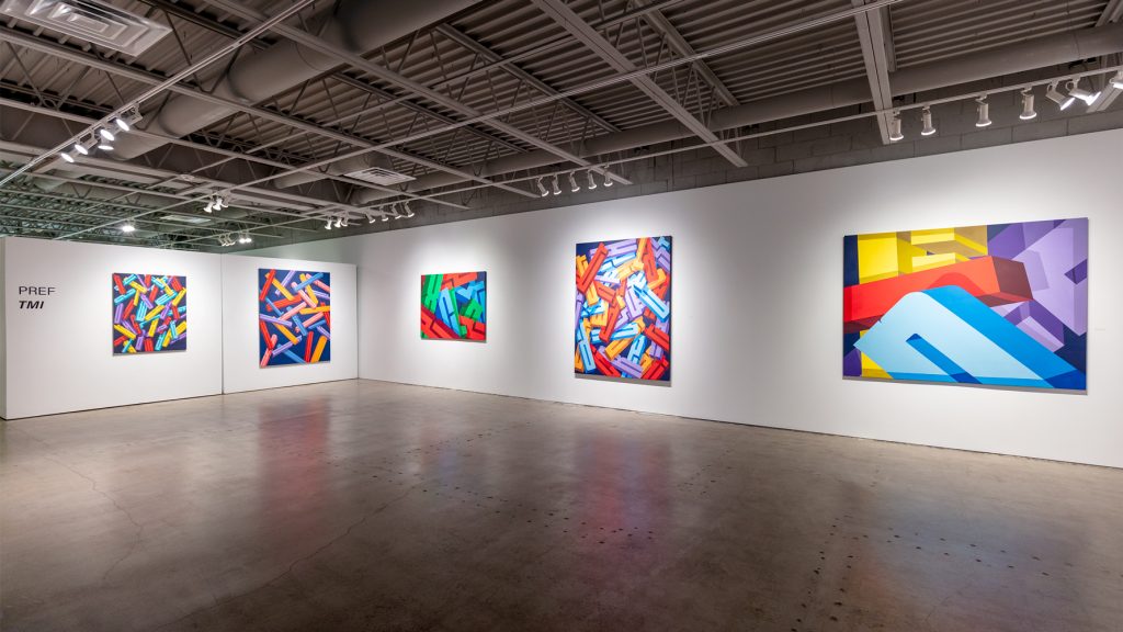
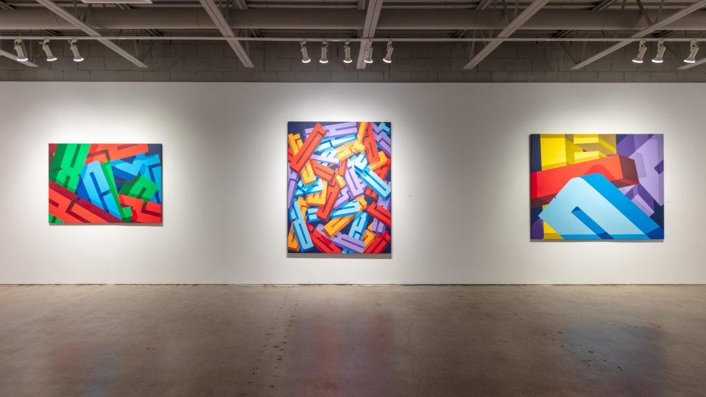
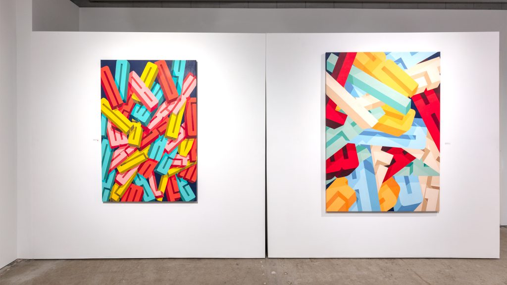
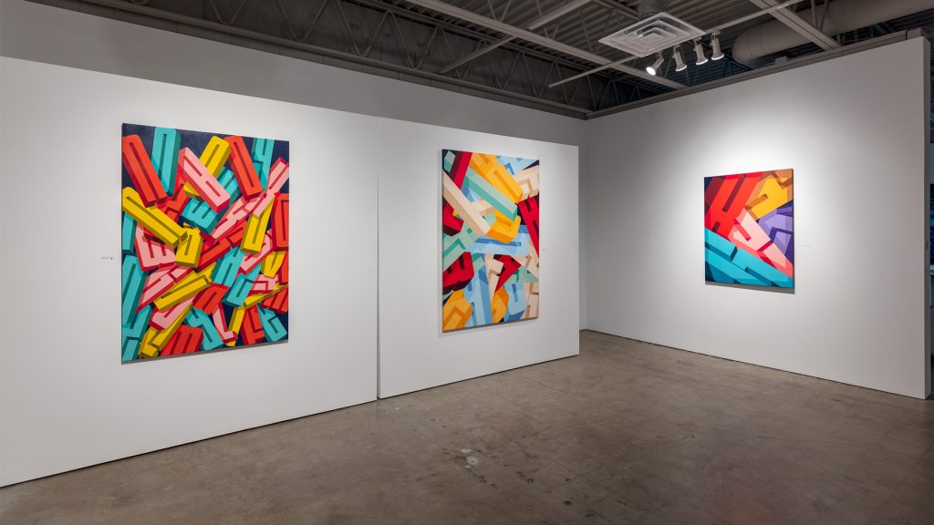
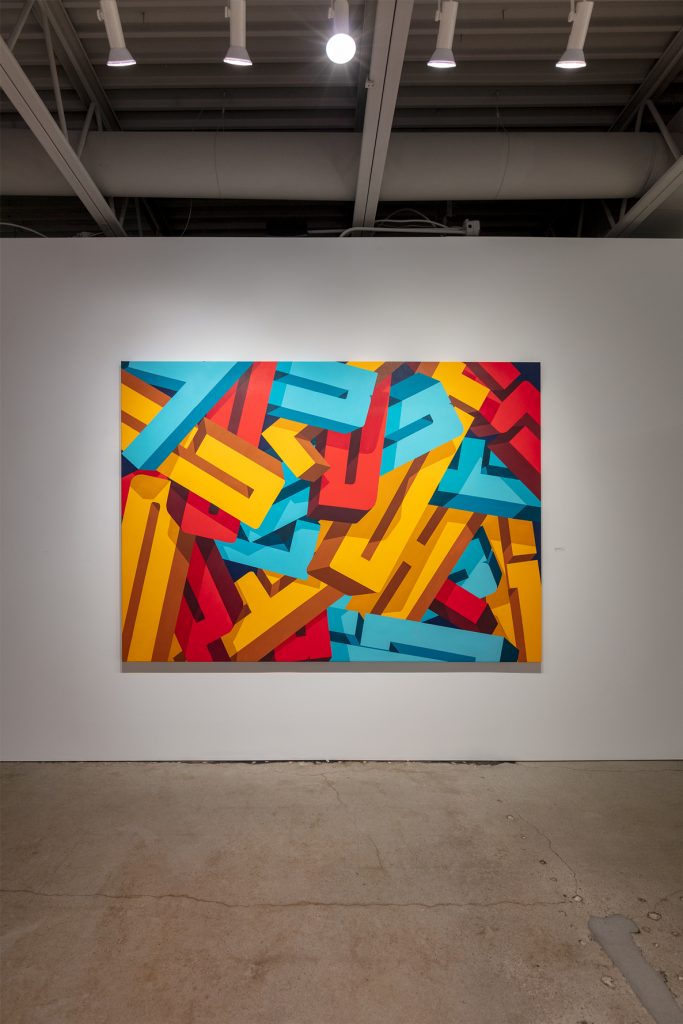
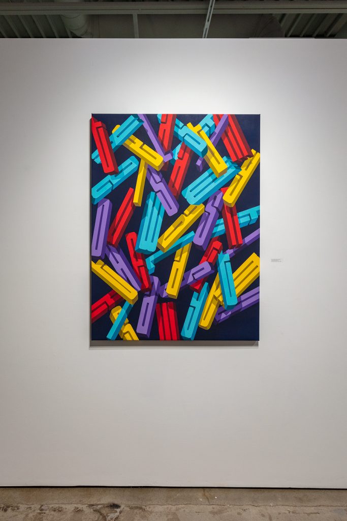
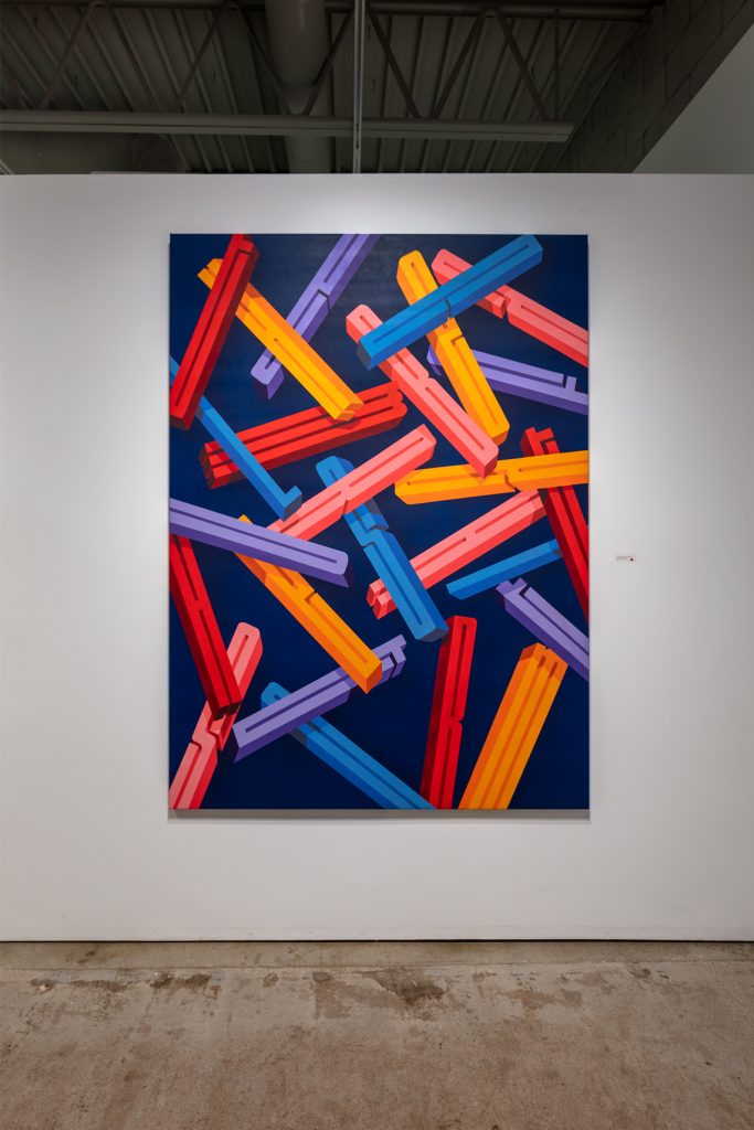
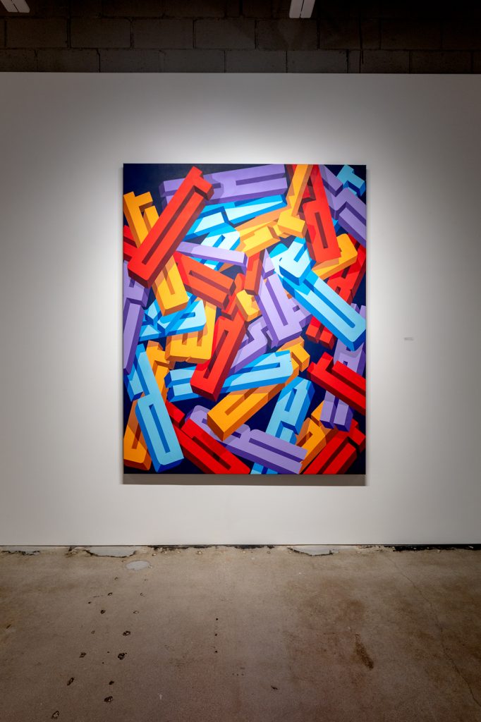
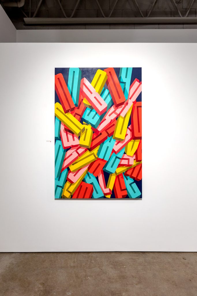
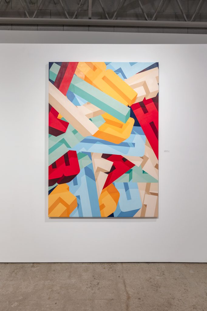
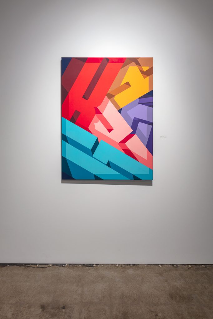
Pref is compositionally shifting within the canvas space, as well. No longer floating amidst a colored blank, Pref’s letters touch—nay, hit, in fact—the edge, in a right to left downward motion, maintaining a readerly stance. “I Like the One with the Dog,” for instance, is a dense mash-up of the titular sentence, using shadow play that slightly obstructs the shape of the letters so that any scansion of the painting as the sentence that it holds is full of seams, full of visual “clinking and clanging,” which Pref says he can sometimes imagine hearing when he views the new series. He wanted to work in a way that the frame could barely contain his subjects.
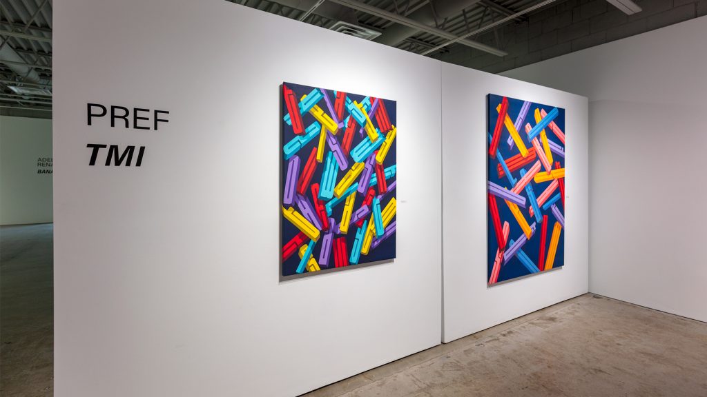
“The Last Time I Saw You Wasn’t the Last Time I Saw You” presents slightly smaller, taller, narrower characters, falling at a velocity that allows for more black space between each letter of this tautological assertion. The more diffuse nature of these letters indicates more action, as if the dropping is happening right now, and there is no confusing this present participle from a possible pile of landed letters. With “The Last Thing I Cooked Wasn’t That Great” and “I Couldn’t Stop Laughing,” however, Pref makes a mundane statement into a new kind of run-on sentence or utterance. Like old refrigerator magnets off their intended magnetic surface, gravity takes over and the letters are in freefall, flattening into the two-dimensional.
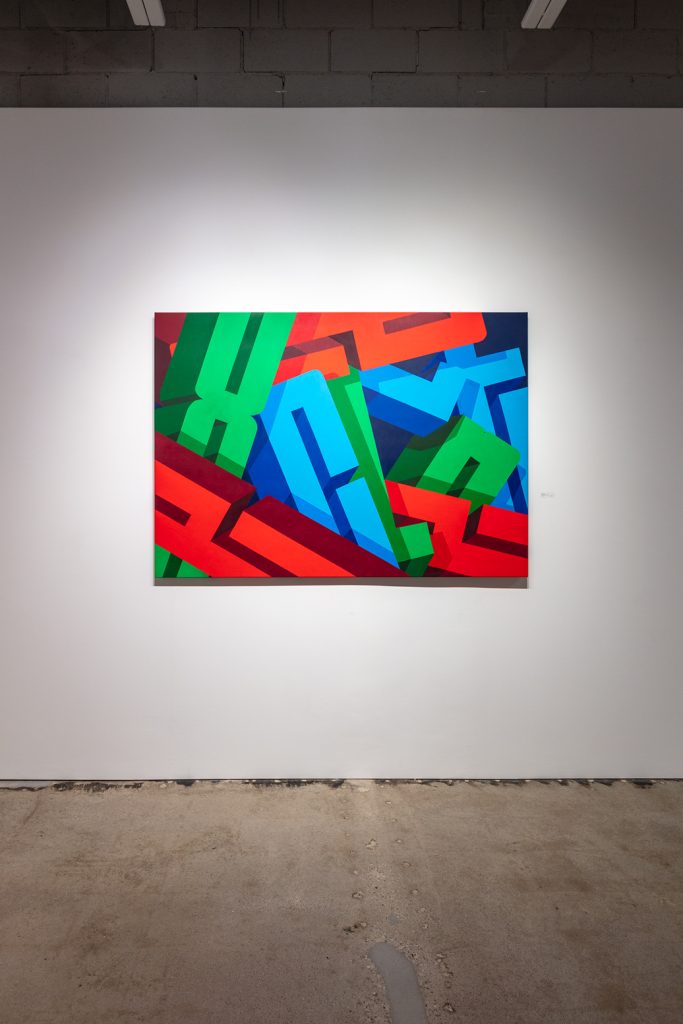
“Excellent,” “Great,” and “Nice” are enlarged paintings in that they capture only one word each, but still cluster in a way that it is difficult to tell one character from another. A zoom lens on these mosh pits of individual words, and its parts, invites the viewer to participate in Pref’s investigative visual world. Pref is a man of fun letters, making works that clink themselves together in joyful toasts—Cheers!
VIEW WORKS ON ARTSY.NET | INSTAGRAM
Exhibit Images

