TEXT BY NICK LAPOLE
Daydreaming is a risky proposition in contemporary times. To daydream, after all, is a private affair, an internal alchemy best kept under lock and key, lest a lecturer or micromanager take notice and, with the slap on the wrist, wrestle the laze apparent away from their menagerie of ‘distractions.’ To daydream out loud runs the simultaneous risk of a) calling attention to our innermost machinations and b) puncturing the precious ship of fancy that staves off the doldrums of reality. Or so they say.
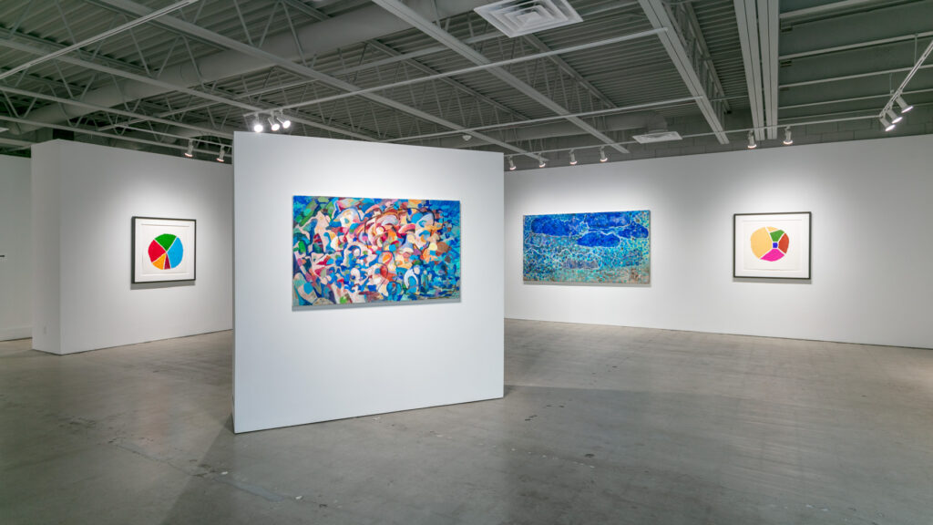
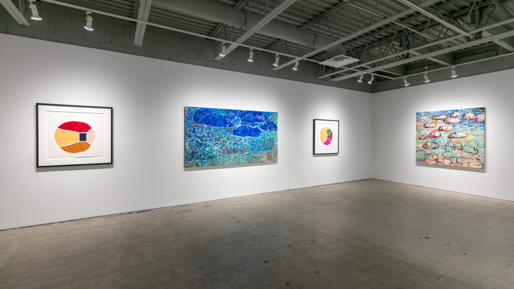
Al Harris-Fernandez takes his chances in “Daydreaming Out Loud”, his latest exhibit where daydream environments and veteran techniques are presented together, side by side. While they first feel contradictory, as if pitting paint’s zealotry against design’s detachment, it is through these two approaches that Al’s pedagogy manifests in all its nuance.
Al’s process and artist statement are one in the same. In it, he describes the work with basic, step-by-step instructions. He preps the surface, layers the paint and, when said layers accumulate to a certain degree, rotates the canvas to start anew. This process continues and the orientation spins unimpeded until repeated actions and personal intuition seize upon the finished painting. In a way, the artist and audience encounter the work on equal terms. Together they face a primed surface of connotation.
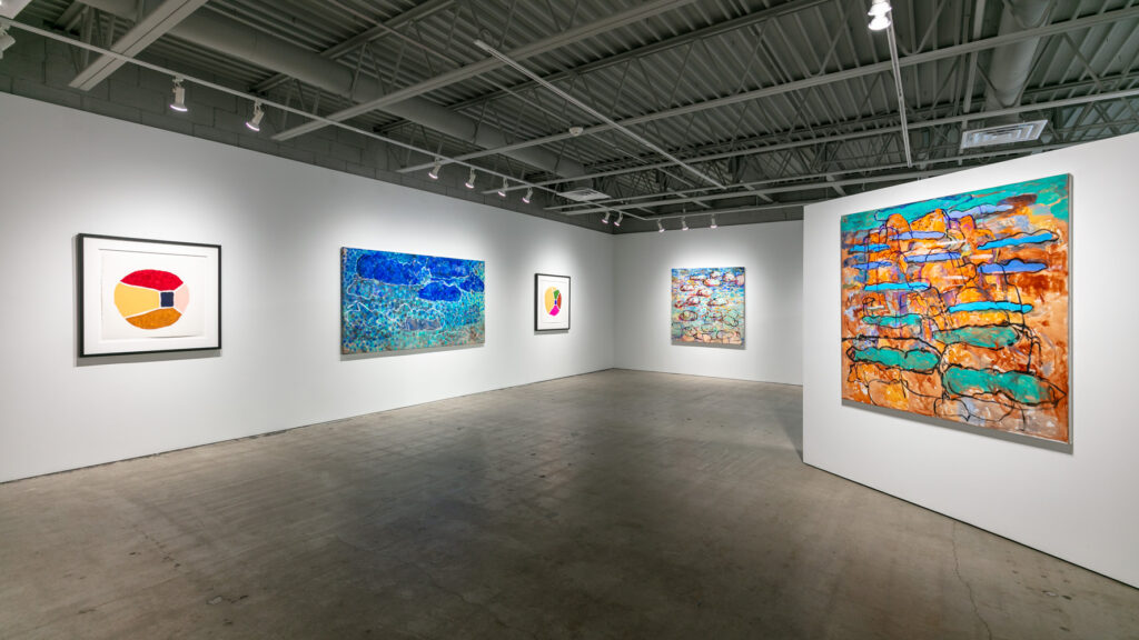
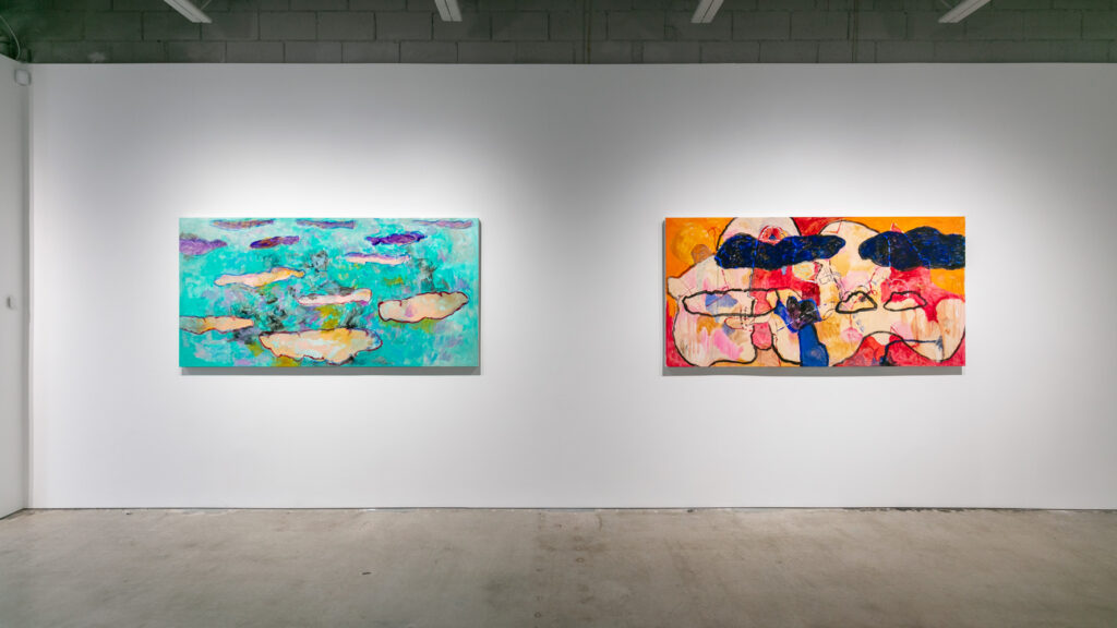
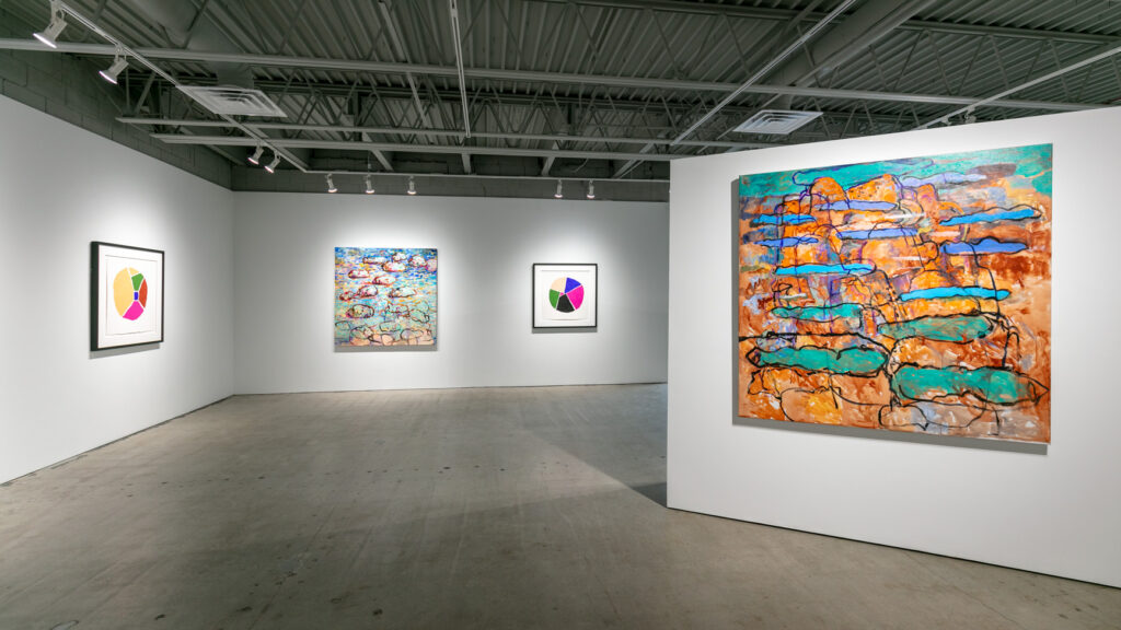
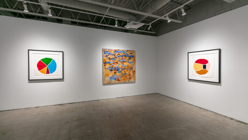
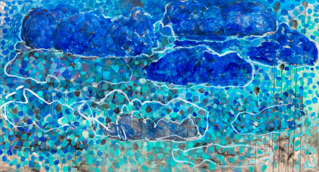
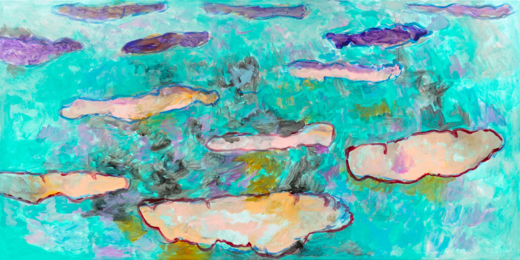
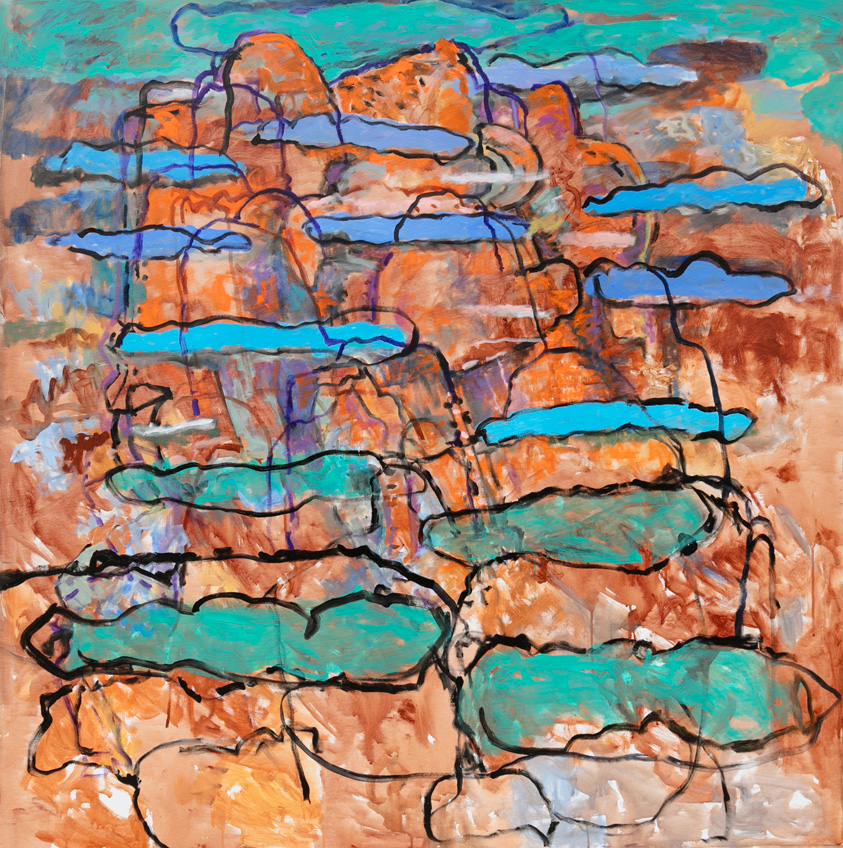
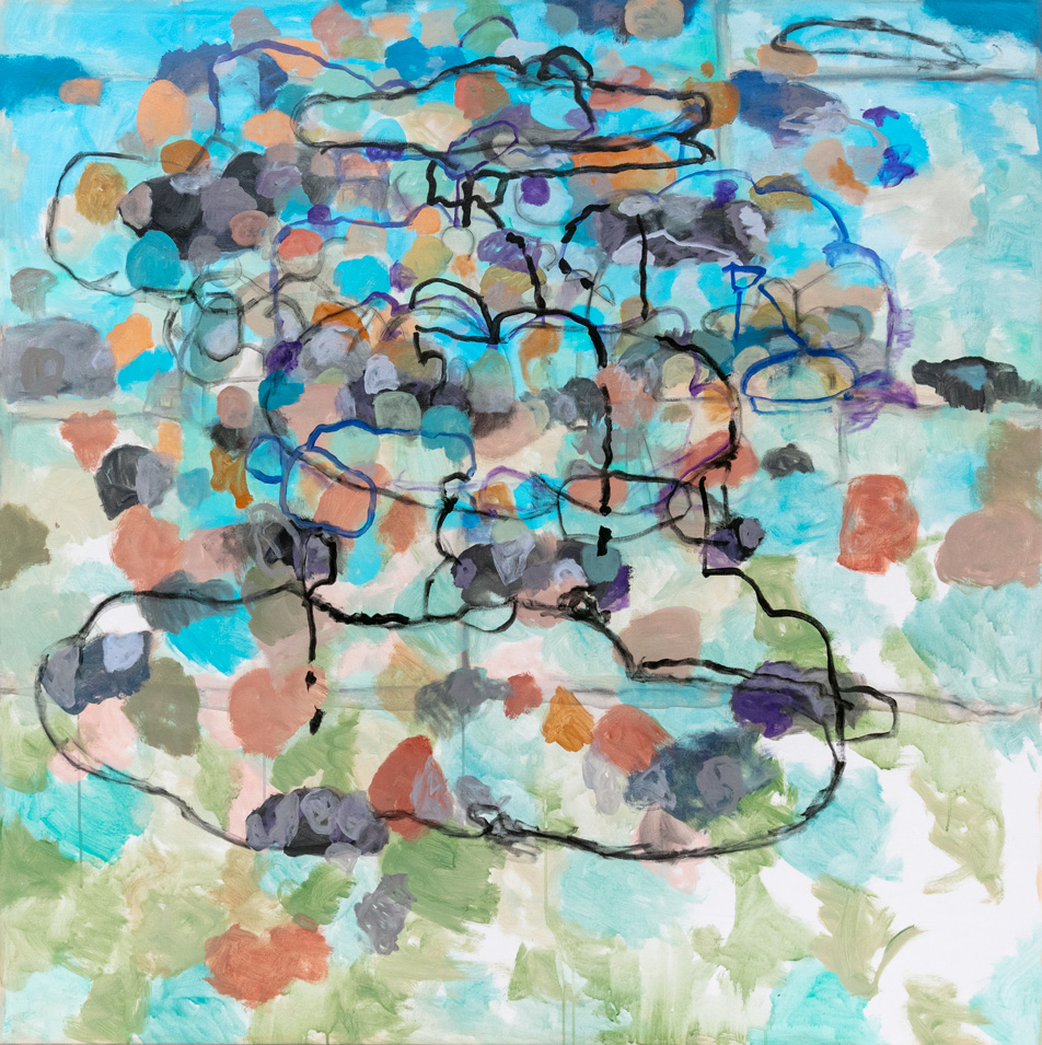
This surface is made up of oil on canvas, where a wide variety of painterly effects give shape to a collective unconscious. They consist of washes and dabs strewn along orange and bluish hues, which percolate together into an Ab-Ex atmosphere. This backdrop affords ground to sturdier stuff, stuff that alludes to forms like clouds, puddles, rock formations, and other bodies that skip restlessly on top of the roil. This evidence allows purchase for all manner of audience inferences.
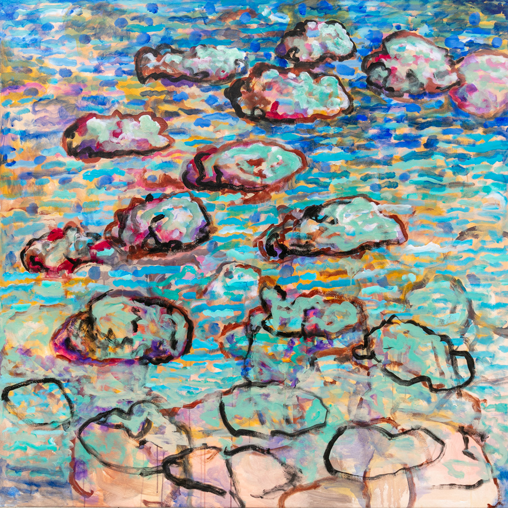
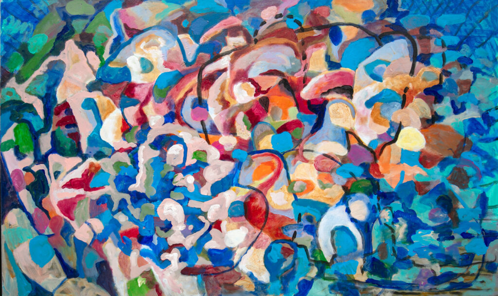
Consider “Back Garden.” It features a warm body pelted by cool water, writhing with a cadence akin to a Cecily Brown painting. Water droplet blues fuel the cylindrical force that corrals the warmer components inward, towards the center of the composition. Eyes follow suit and, in time, they may notice how warm and cool refuse to mix. The colors spar in space and, like oil and water, grant no quarter. Ultramarine may transition to azure until, eventually, baby blue. Carmine mellows to tangerine and desaturates further into a brandy shade of brown. Areas may fade alongside their efforts, but they maintain their contours.
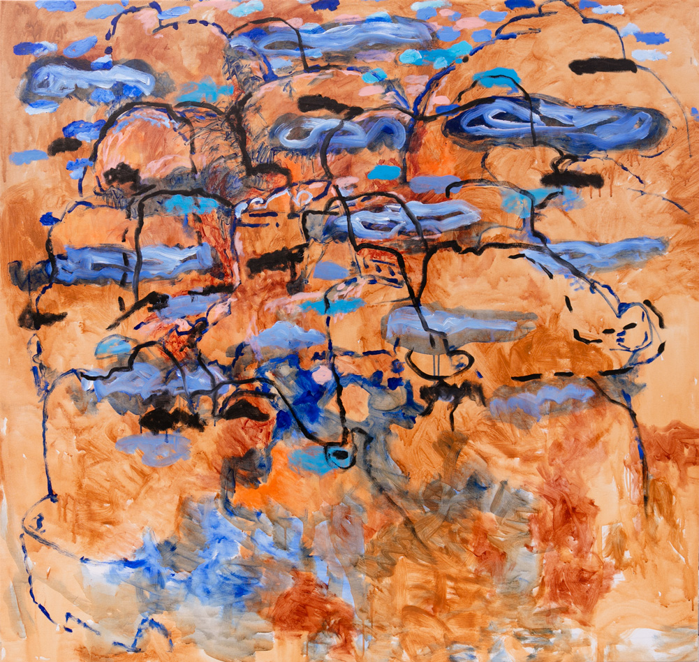
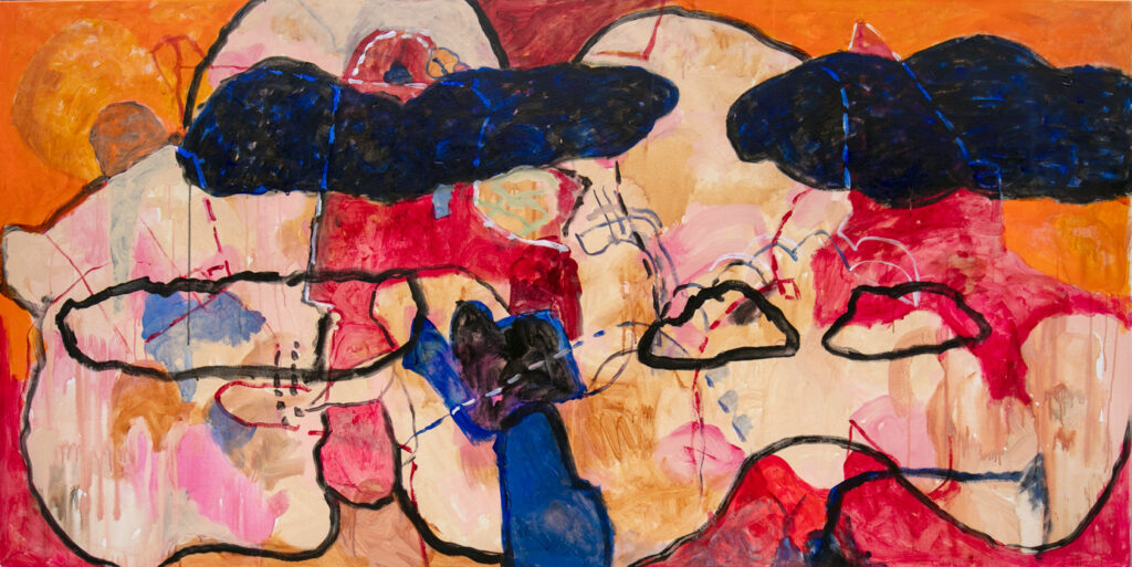
“Time Zones” maps the canvas like a topographical display. Masses of crimson and tiger orange hint at elevations, perhaps implying an escalation of activity from zone to zone. Their black borders enforce separate territories, even if the distinctions are limited between No Man’s Land and razed landscapes. Reprieve is hard to come by; dark clouds, articulated in a Gustonian manner, seem poised to bring further calamity. This is an omen of a painting, where painter, viewer, and refugee move tentatively through the piece. Dotted lines track their trajectory and offer a pathway for those fresh to an otherwise unforgiving climate. The road ahead wasn’t easy for them and it won’t be easy for those who come next, but the pursuit is a proven possibility.
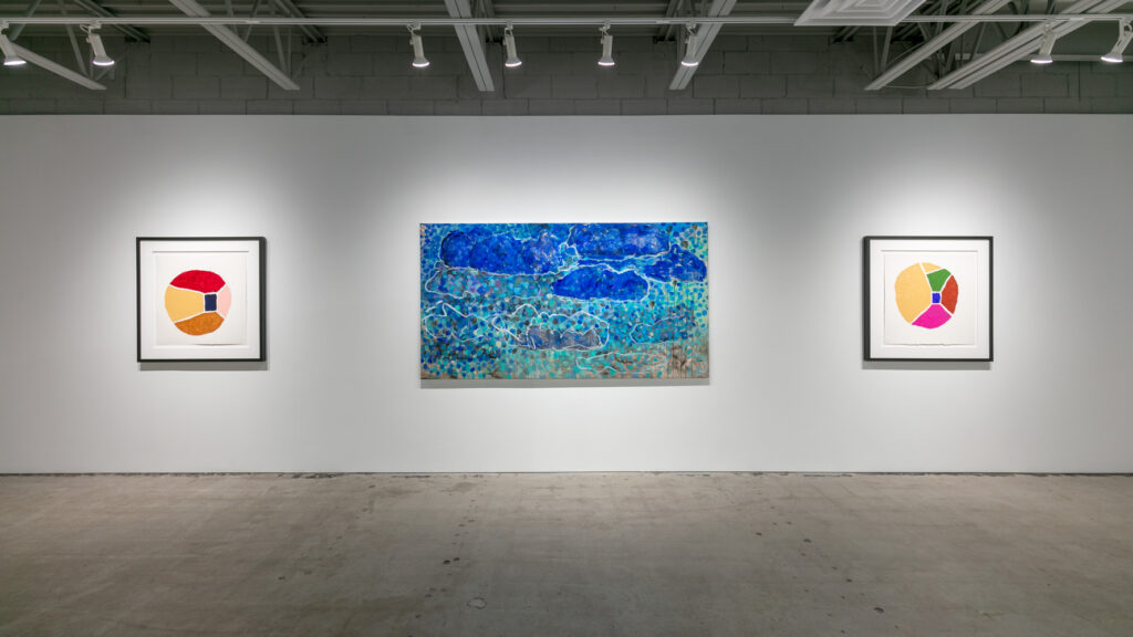
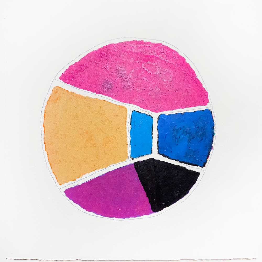
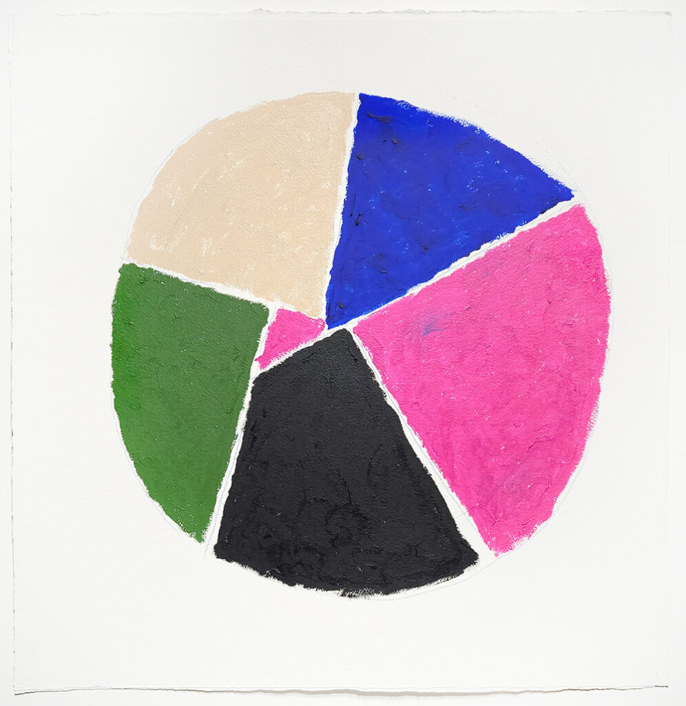
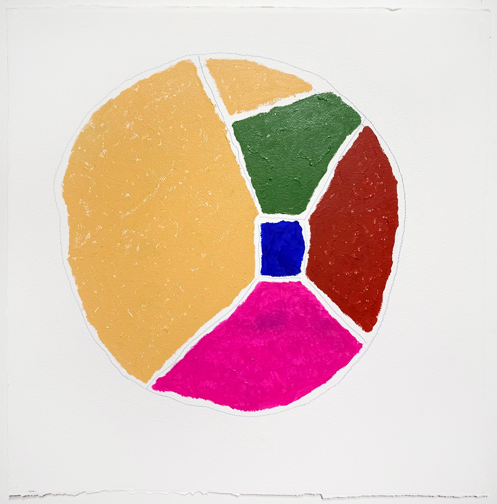
If the oil-based works are dreams defined through pigment, the acrylic pieces are noticeably more calculated. They are works on paper with square dimensions that depict the artist’s process in an organized, economical manner. Instead of obfuscation through overlap and repetition, the devices are presented here in stark, brutally honest terms. The primary form is a circle, a so-called “Pie Chart”, made up of several sections of color that appear to operate in parallel with their oil on canvas counterparts. A thin sliver and a massive wedge indicate the percentage of paint elsewhere in the gallery. The circular form, too, may allude to the consistent rotations employed in the studio. With this read in mind, the Pie Charts become both studies and standalone pieces.
We see these operations play out in “Pie Chart #1.” Each slice is indicative of a quality, a quality of lesser or greater proportion than the others. There is no key or organizing principle beyond them and their relationship with the whole. While sturdy enough from a distance, the graph resists a static interpretation due to the painterly execution. Each area of color crackles at the edges, after all, with nothing to contain them save the faint, graphite demarcations. Prior paintings in this series were caked from corner to corner, but these charts leave much of the paper white exposed. The composition, held together by pencil lines, feels especially prone to fault and future readjustment. Divisions may hold for now, but who knows for how long.
Instability applies to the pie chart principle itself. “Pie Chart #2” brings about an unexpected variation to the graph. Data is made spatial. When an expected piece becomes a rectangle, depth is formed and allusions to walls or windows spill forth, through which light (or, in this case a black mass) emanates. The color may be contained by pencil, but these colors, much like the composition, have been polluted by an undercoat that pokes out shyly from the edges. The implications are just as subtle. Previously, the audience was left to judge the contents of a flat icon alone. Here, the chart transforms into a room where ruminations, objects, moralities, and imagined inhabitants can occupy.
“Daydreaming Out Loud” is as much about the dreamscapes inferred as it is about the peepholes through which we categorize and ascribe meaning. The exhibition charts out our sentiments from the vantage point of abstract culminations and minimalist reductions to prove how a daydream and a declaration are, in fact, one in the same. Task masters may shiver at the revelation but, despite the danger of whirlpools and the anxiety of distant resolutions, the artists and their audience are encouraged to dream, to speak, to rest easy.
“Daydreaming Out Loud”, Al Harris-Fernandez’ latest exhibit, is composed of daydream environments and veteran techniques presented together, side by side. While they first feel contradictory, as if pitting paint’s zealotry against design’s detachment, it is through these two approaches that Al’s pedagogy manifests in all its nuance.
“Back Garden” features a warm body pelted by cool water, writhing with a cadence akin to a Cecily Brown painting. Water droplet blues fuel the cylindrical force that corrals the warmer components inward, towards the center of the composition. Eyes follow suit and, in time, they may notice how warm and cool refuse to mix. The colors spar in space and, like oil and water, grant no quarter. Ultramarine may transition to azure until, eventually, baby blue. Carmine mellows to tangerine and desaturates further into a brandy shade of brown. Areas may fade alongside their efforts, but they maintain their contours.
“Time Zones” maps the canvas like a topographical display. Masses of crimson and tiger orange hint at elevations, perhaps implying an escalation of activity from zone to zone. Their black borders enforce separate territories, even if the distinctions are limited between No Man’s Land and razed landscapes. Reprieve is hard to come by; dark clouds, articulated in a Gustonian manner, seem poised to bring further calamity. This is an omen of a painting, where painter, viewer, and refugee move tentatively through the piece. Dotted lines track their trajectory and offer a pathway for those fresh to an otherwise unforgiving climate. The road ahead wasn’t easy for them and it won’t be easy for those who come next, but the pursuit is a proven possibility.
Each section in “Pie Chart #1” is indicative of a quality, a quality of lesser or greater proportion than the others. There is no key or organizing principle beyond them and their relationship with the whole. While sturdy enough from a distance, the graph resists a static interpretation due to the painterly execution. Each area of color crackles at the edges, after all, with nothing to contain them save the faint, graphite demarcations. Prior paintings in this series were caked from corner to corner, but these charts leave much of the paper white exposed. The composition, held together by pencil lines, feels especially prone to fault and future readjustment. Divisions may hold for now, but who knows for how long.
“Pie Chart #2” brings about an unexpected variation to the graph. Data is made spatial. When an expected piece becomes a rectangle, depth is formed and allusions to walls or windows spill forth, through which light (or, in this case a black mass) emanates. The color may be contained by pencil, but these colors, much like the composition, have been polluted by an undercoat that pokes out shyly from the edges. The implications are just as subtle. Previously, the audience was left to judge the contents of a flat icon alone. Here, the chart transforms into a room where ruminations, objects, moralities, and imagined inhabitants can occupy.
SHOP WORKS INCLUDED IN THIS EXHIBIT
