TEXT BY MICHAELA MULLIN | VIEW IMAGES
Contemporary Abstraction: Collaging Space and Color
Contemporary Abstraction 2.0
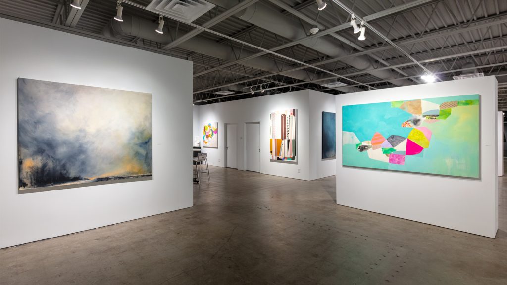
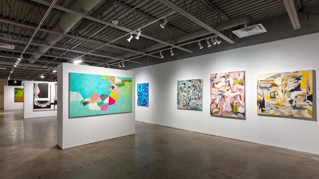
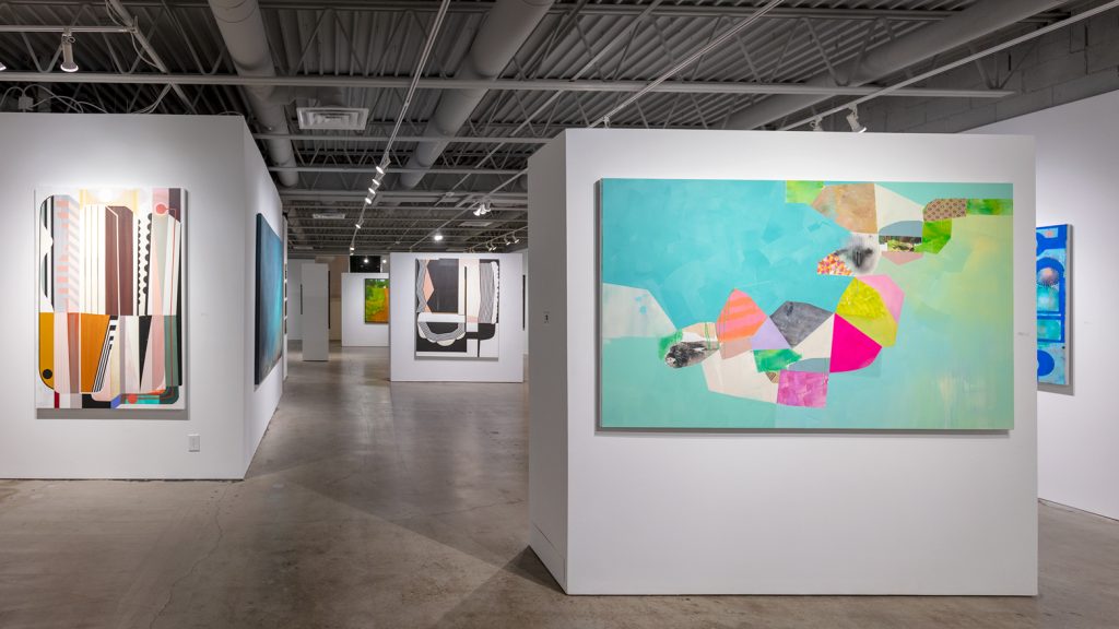
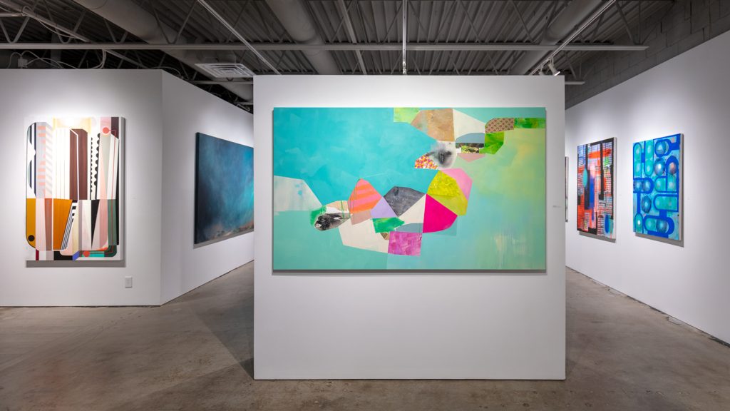
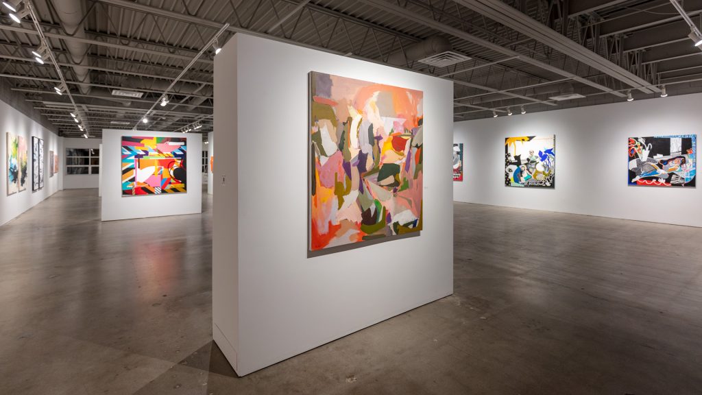
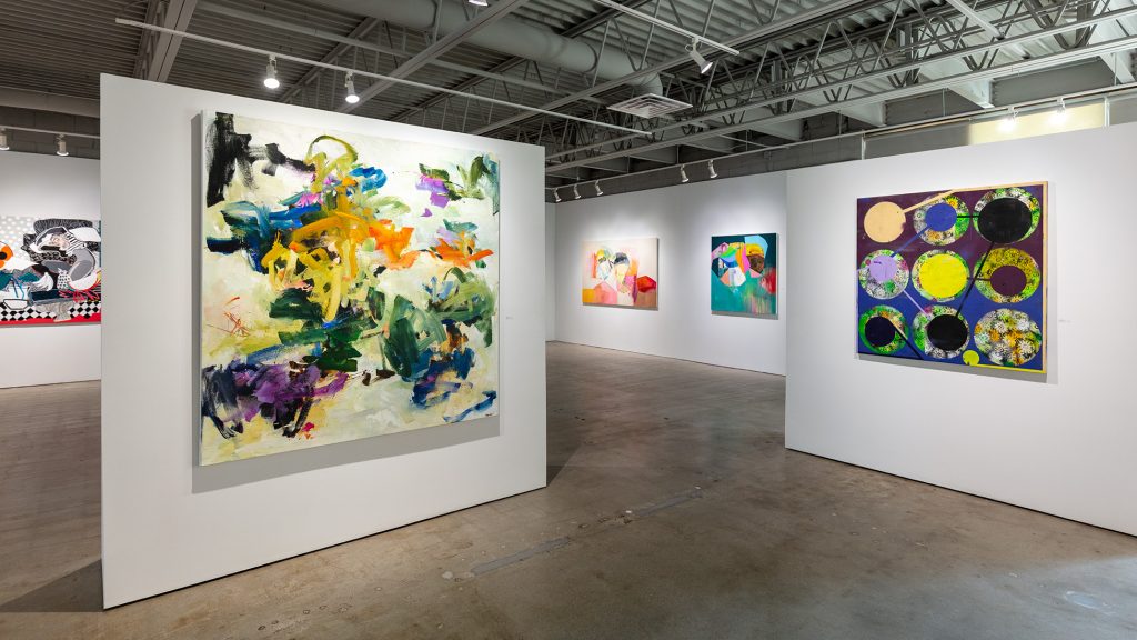
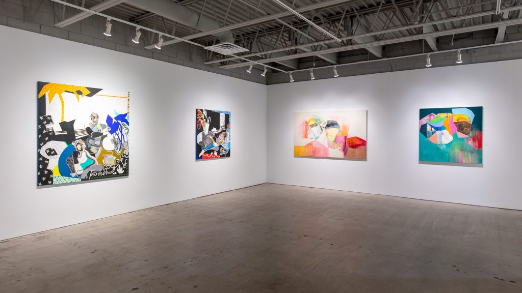
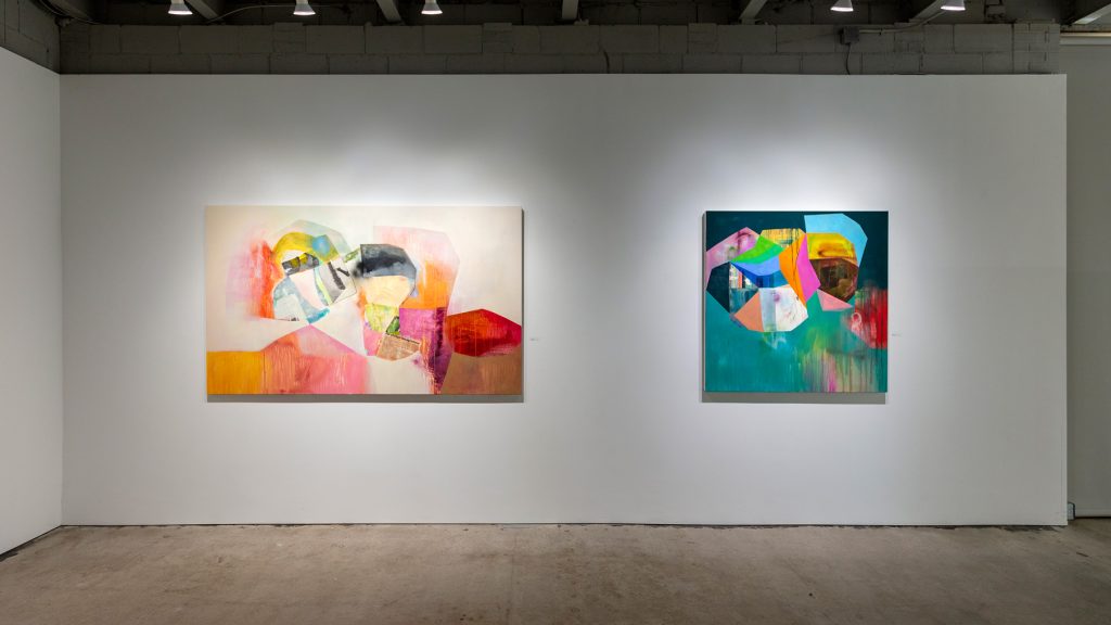
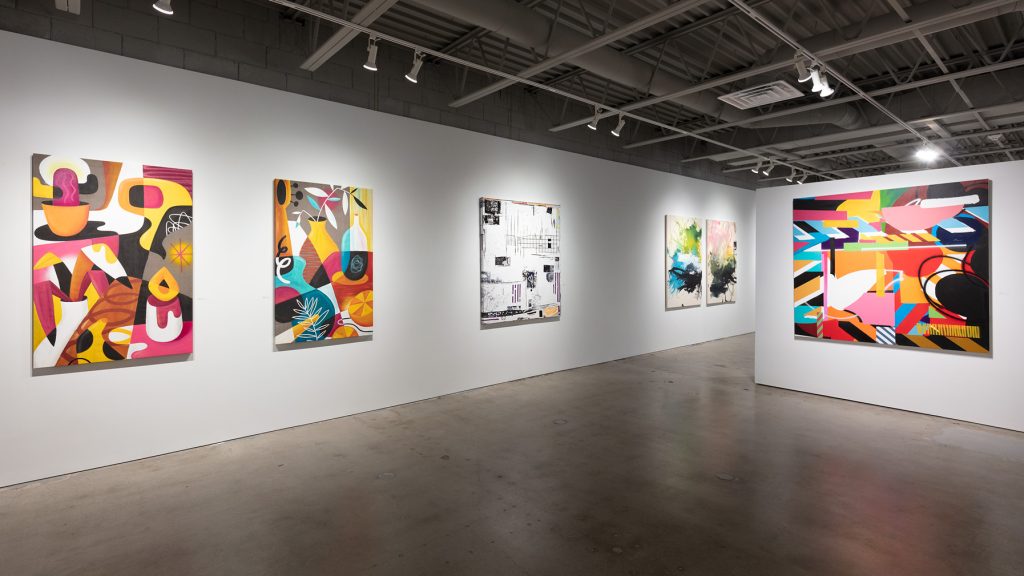
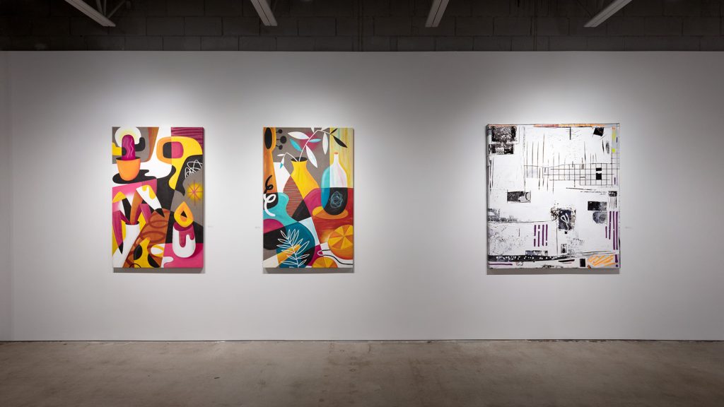
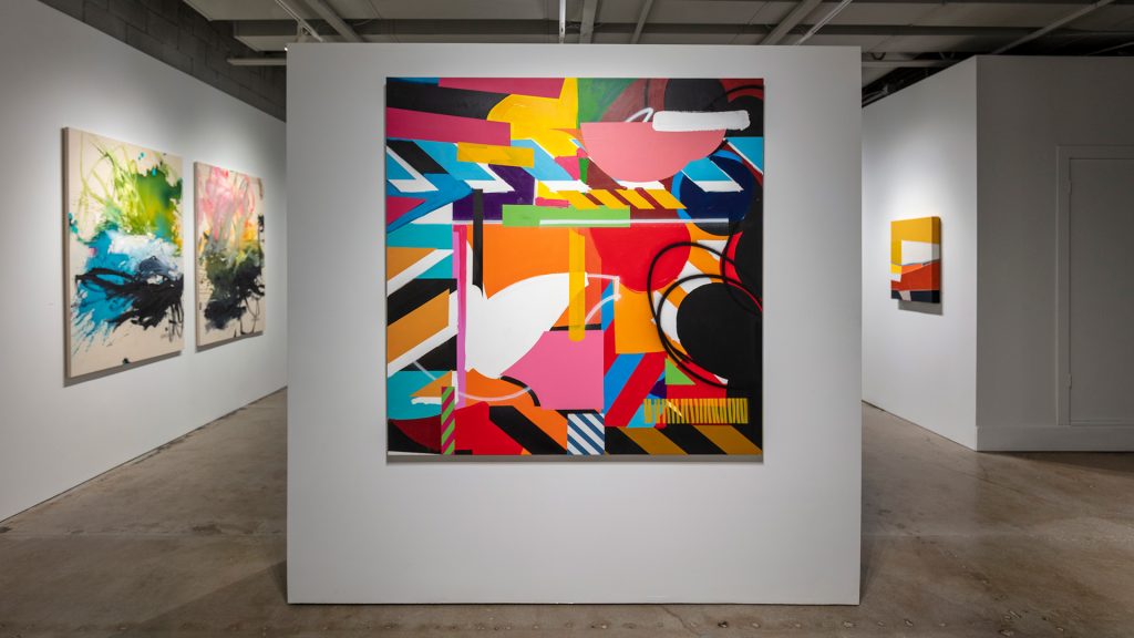
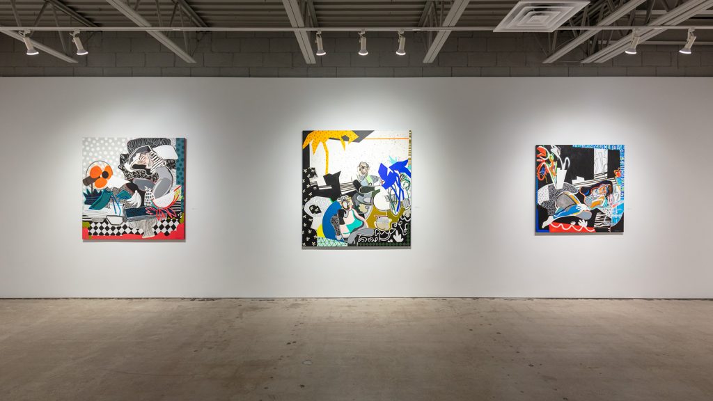
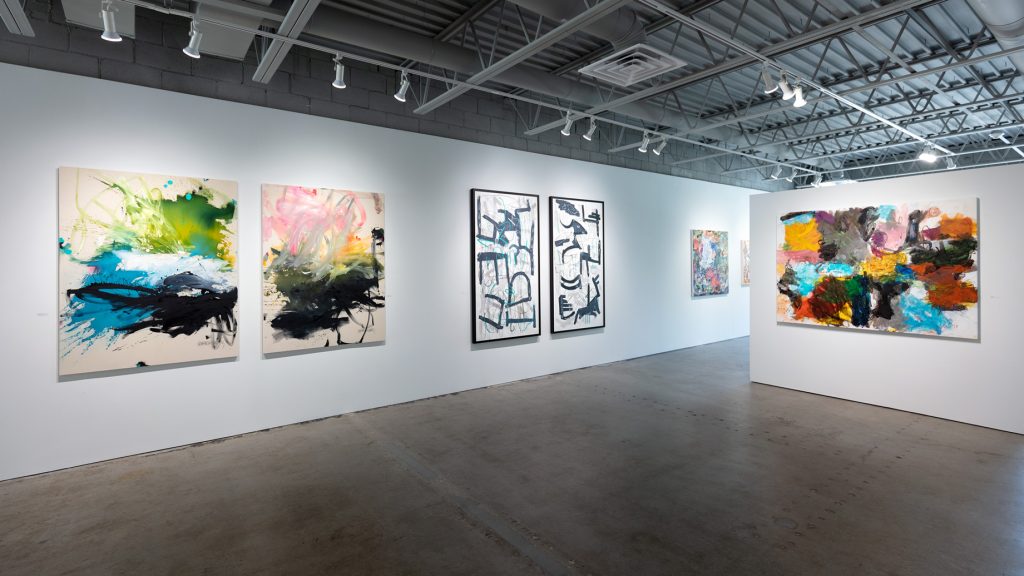
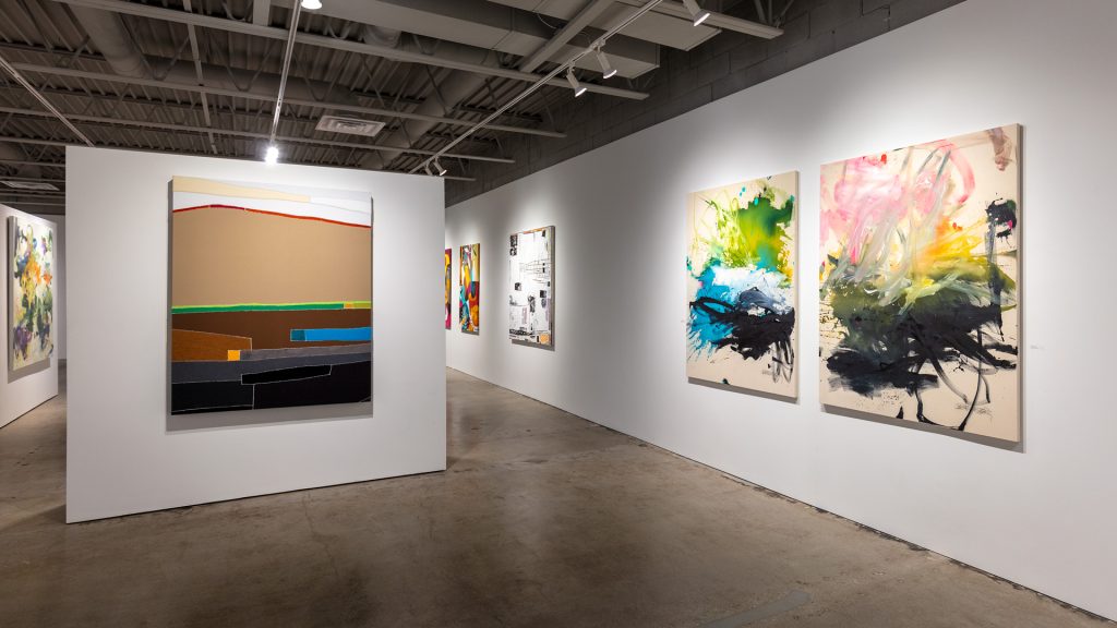
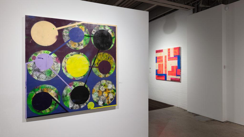
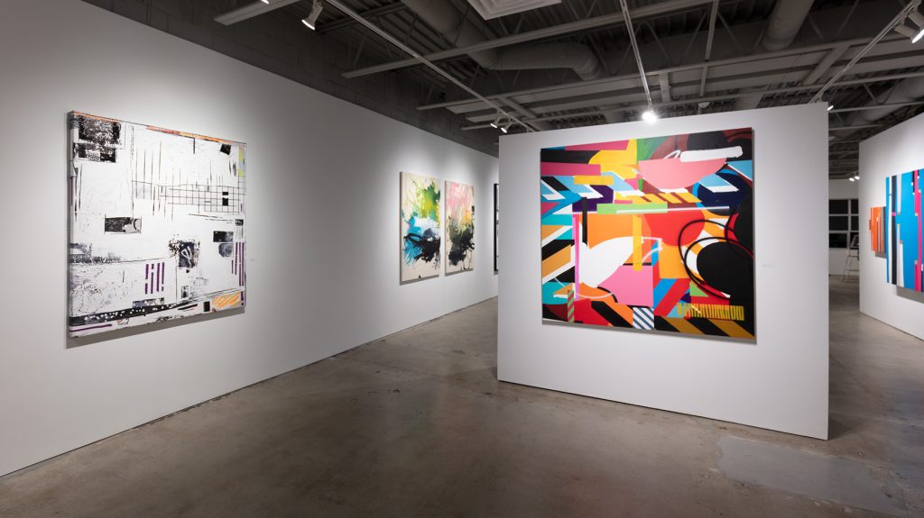
Contemporary Abstraction continues through August—and, on exhibit are even more new works by this show’s amazing artists.
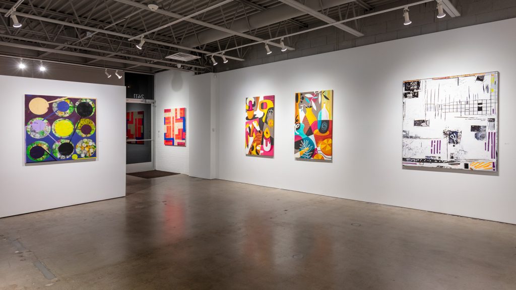
Maser paints collages of shapes and overlay. In bold yellows and green, his blues both hold and float other swaths of color. Geometric diagonal white stripes are wide, both girding and dimensionalizing these large-scale works, and each work uses red as moments of speed within the horizontal compositions. Maser’s black strokes as last application seem to operate as writing and symbol, like abstract ink marks asking to be read.
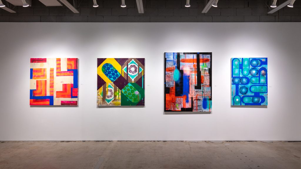
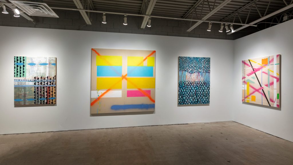
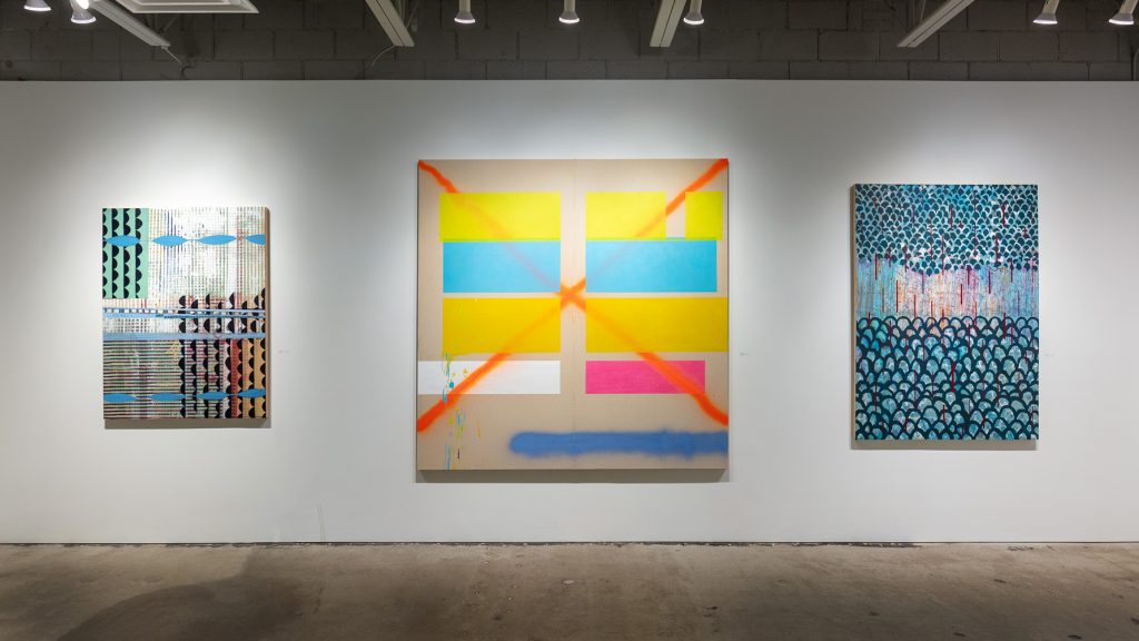
Deborah Zlotsky’s new paintings in spray paint on canvas mesmerize the viewer with pattern, contained and let loose. “Sweet Dreams” is a stunning dormient work, filled with circles of webs, shape and stencil in greens and blues expanding from a central point. Cobalt blue capsules embrace the webs, also invoking circuit boards. “Miscalculation” images lace beneath safety-orange sprays, juxtaposing delicacy and danger.
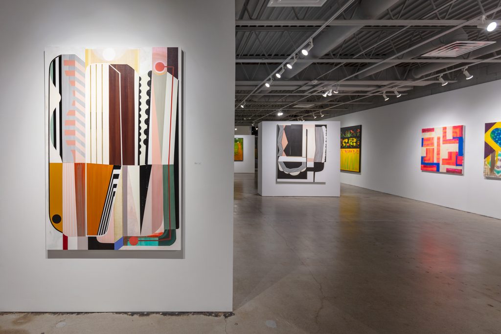
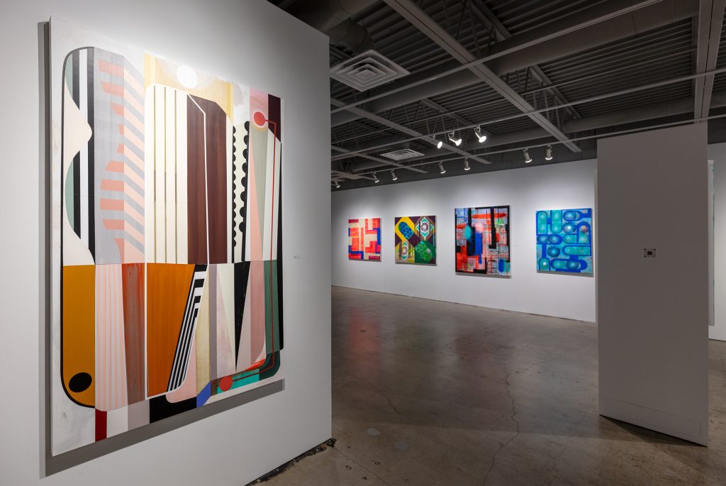
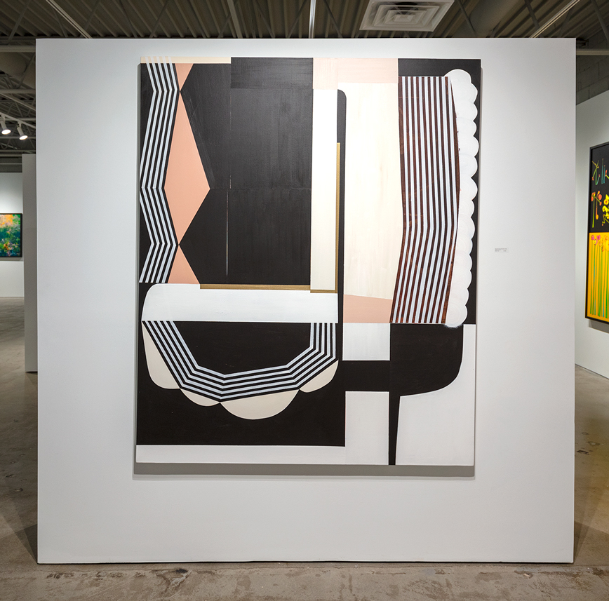
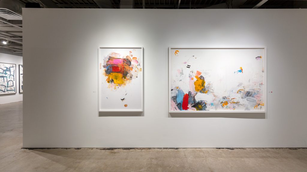
Teo Nguyen’s abstract works continue to investigate white space with color on vellum. Lola Montejo leaves no space unfilled in her four new paintings. Alayne Spafford’s sparer modular forms collage with words and photographic images. Alyson Khan continues to awe with her stripes and geometric shapes in nuanced and evocative pinks and browns, girded solidly with black and white. And Derrick Breidenthal paints darker, supremely vast landscapes, which evoke night vision views, with glimmers of light, evoking both the electric and the natural.
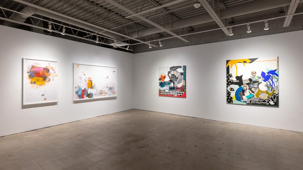
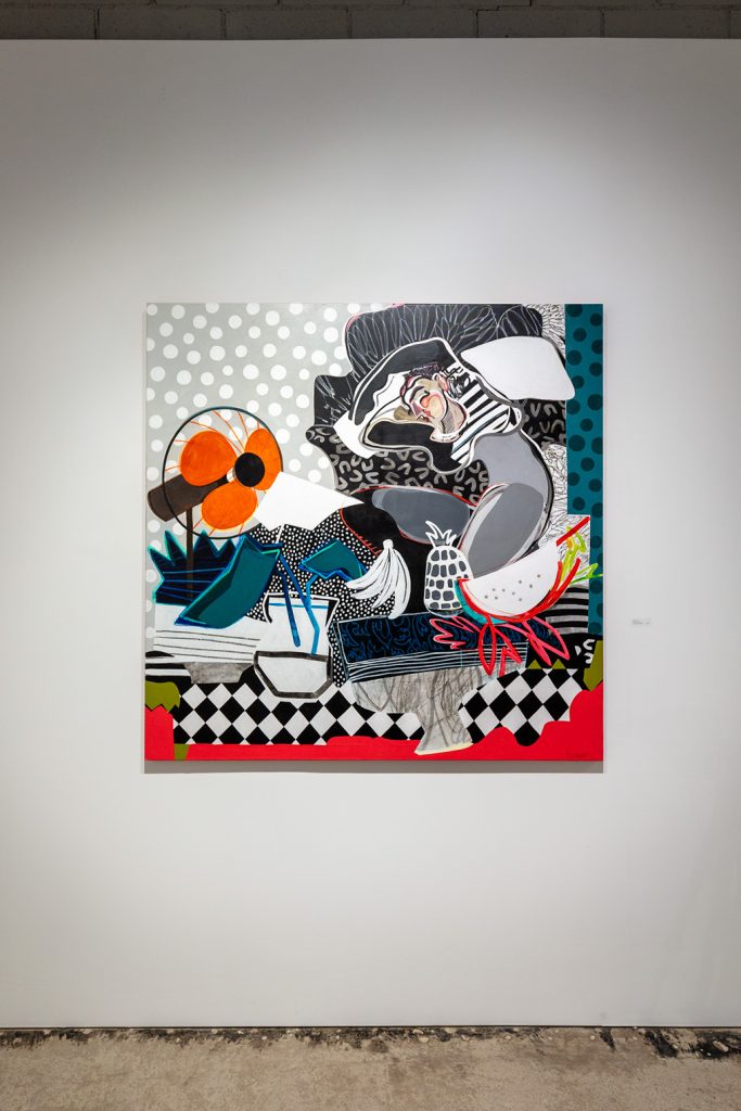
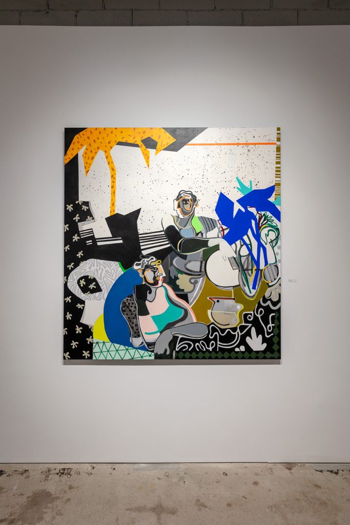
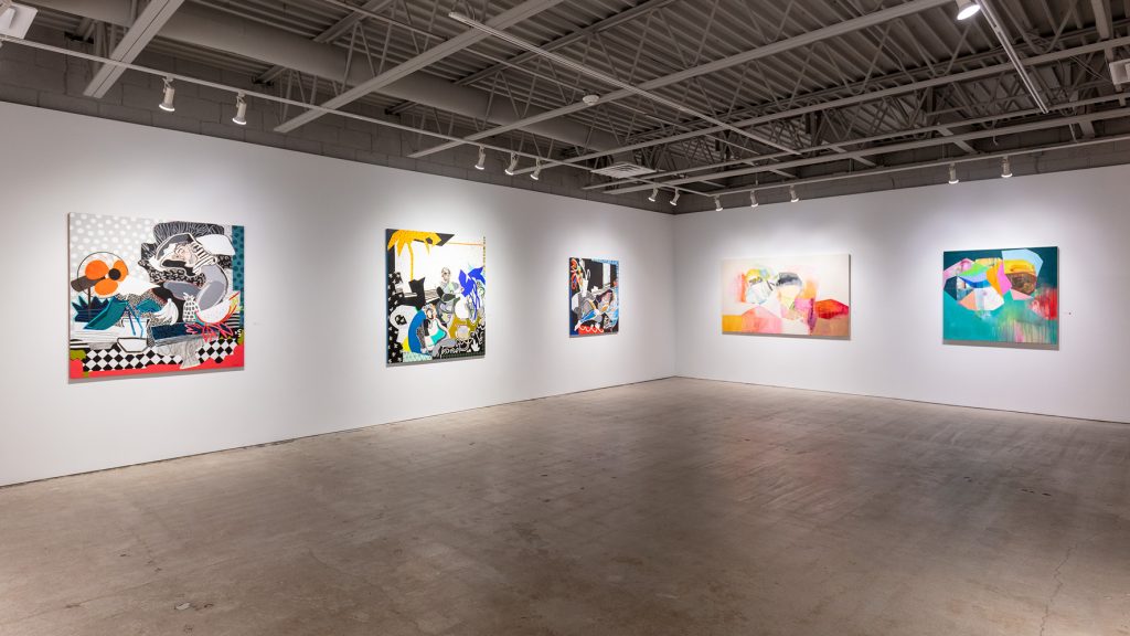
Charoula Nikolaidou’s mixed media works on canvas, “Dream,” “Truthful,” and “Alignment,” elicit a desire to relax somewhere bright and breezy. Life by the sea, perhaps, in its beautiful blur of heat and cooling elements, fresh fruit and water. In these, there is a feminine nuance that perfectly overwhelms composition and style, with Matisse-like moments of collage. Nikolaidou’s figures suggest leisure—bodies in repose, lips anticipating succulence. She uses a more primary palette in these new pieces, underscoring the basic simplicity that life can offer. Though compositionally full, there is a calm presented with objects such as a fan, a vase of cut flowers, a jug beside bananas, pineapple, and watermelon. Whether exterior or interior scenes, in the paintings of Nikolaidou, natural sweetness is infused and often framed with patterns of polka dots, zebra stripes, checkers, grays, and black, to emerge the white and the light of her images and imagining.
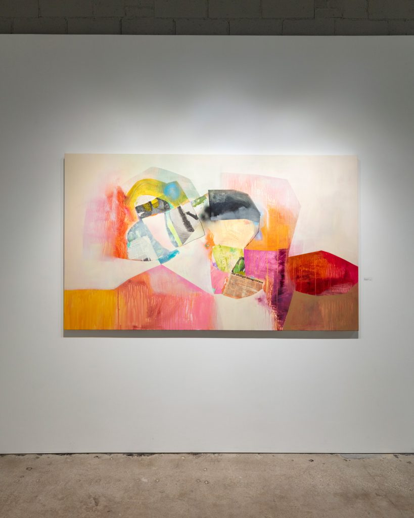
Alayne Spafford’s mixed media works float on the canvas, collaged pieces forming organic shapes that boulder together in soft washes of bold strokes. The paint drips remind of veins and sinew, thus offering both the architectural and anthropomorphic. It the arch-morphic that Spafford creates. Points meet and balance. Pages of newspaper notify beneath and amongst the sections of her build. Letters, in English and Swedish, transform the visual language to a personal auditory experience. And the corner of a newsprint image reminds us of all the ways the world is mediated and all the ways we experience connection.
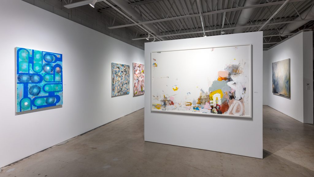
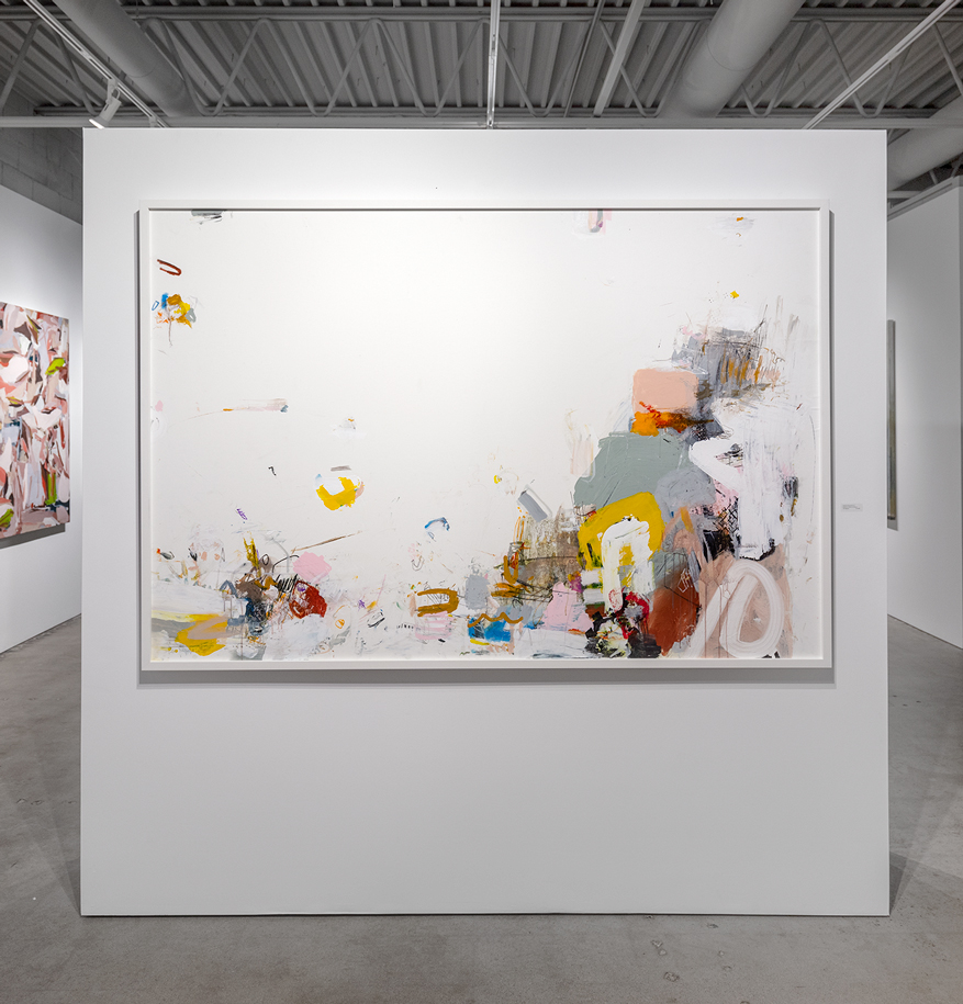
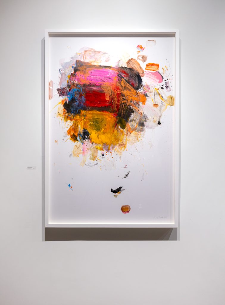
Teo Nguyen is a space explorer in both his landscape and abstract paintings. Expansive as the view is, however, the details are astounding. In his new paintings on vellum (mounted to Dibond), Nguyen explores white space, creating an image of what reverie might look and feel like: an imperfect swirl-circle of paint—mixed, layered, and textured so the dimensional is supported by the oh-so smooth substrate. Moments of paint dot the bottom of the composition like bubbles leading to the colorful mass above. There are translucent and opaque areas, where imprints are left that look suspiciously like lips in a kiss. The subtle impasto reminds of the action once behind each brush and knife stroke—the body, the arm, the hand, the gesture, and the lift.
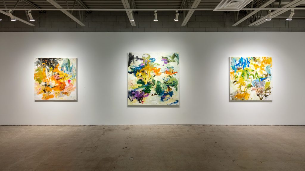
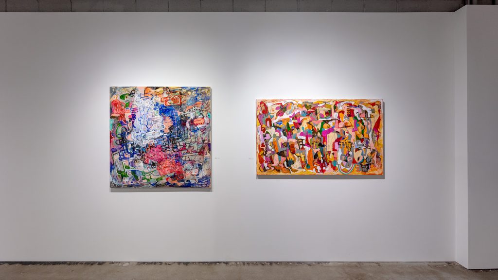
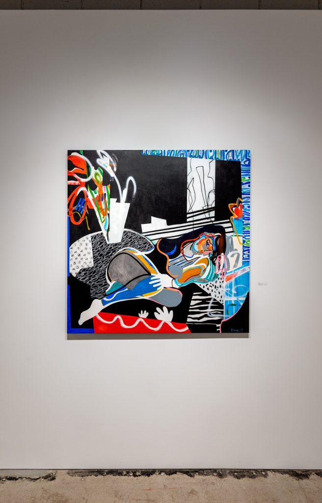
Al Harris-Fernandez paints with a fervor, roundness, and contour that replenish the expressionistic world, perhaps literally and linearly redefine it. “Jam,” “Stacking” and “Map” have such concise titular embraces for the busy-ness and multitude of routes and rerouting going on inside his compositional frame. Harris-Fernandez works in 360 when he paints—orbiting his canvases, becoming the satellite of the works he creates. The compositions seem to expand as sponges taking in colorful opacity, entwining borders and territories, beautifully conflating shape and form, line and stroke, to make images that could be cities, could be a gathering of figures. Either way, Harris-Fernandez uses color to offer narrative arcs that beguile.
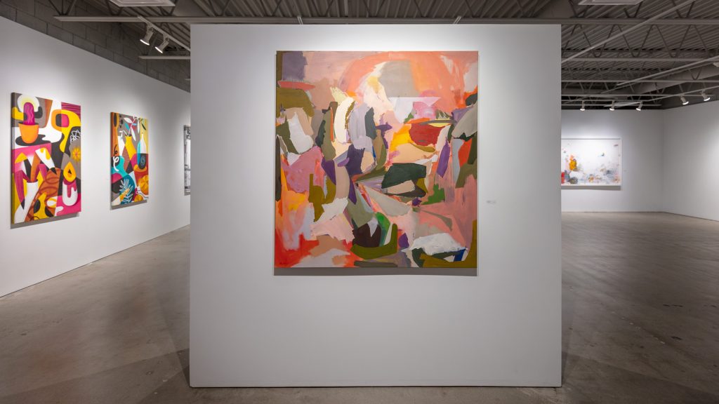
Lola Montejo’s are additive paintings in two dimensions, building up and out like an architectural blossom, capturing both dense and open space. “Dream Hill” leaves no room for blanks though white moments appear to connect and light. Stroke after stroke of corals and rays of yellow are met with arms of olive green, invoking holding, placing, a place to rest. In “Architype”, sections look as if a once-gridded plan has been redistricted with every swipe of the palette knife. The soft browns and reds become lustrous white fleshy pink—the nonrepresentational here still feels so much of earth and body.
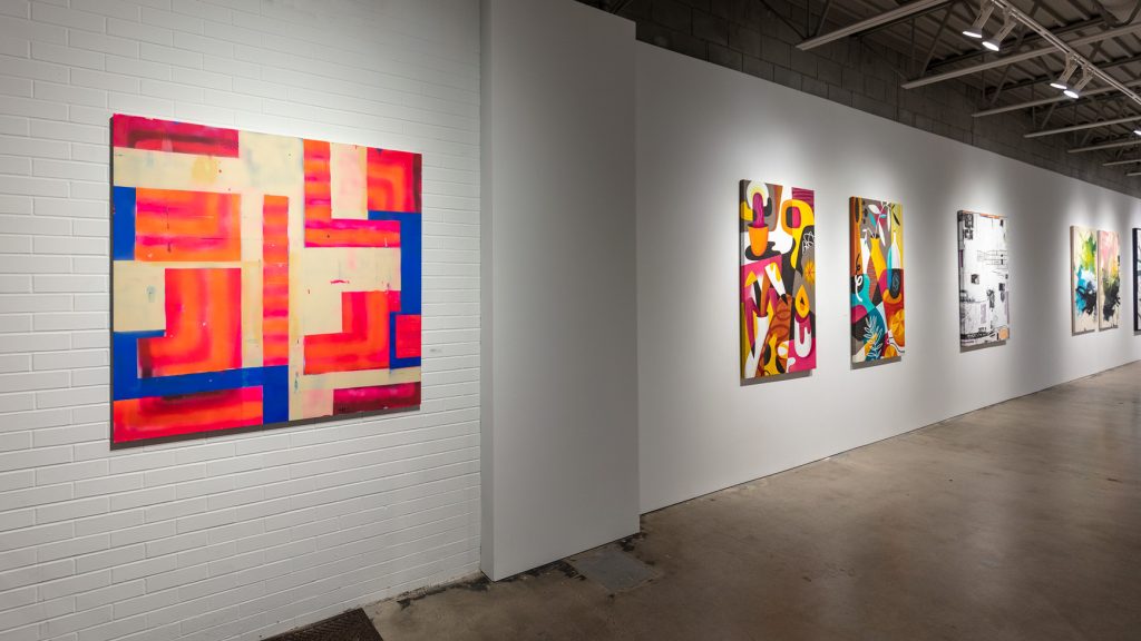
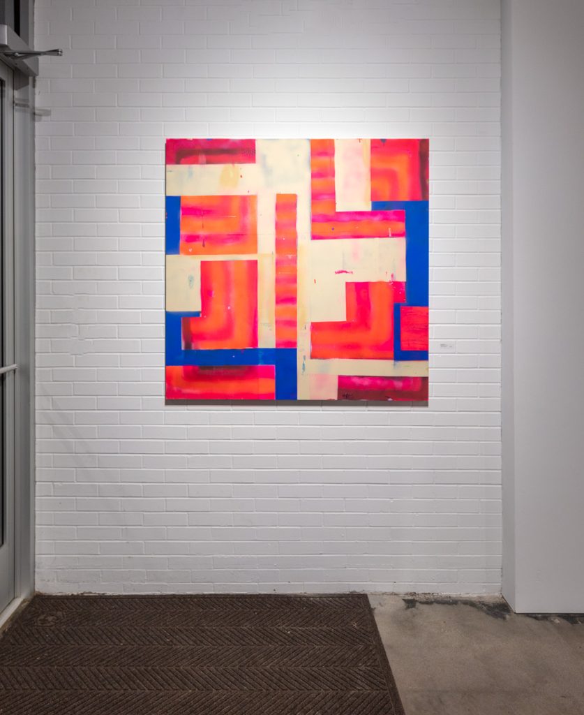
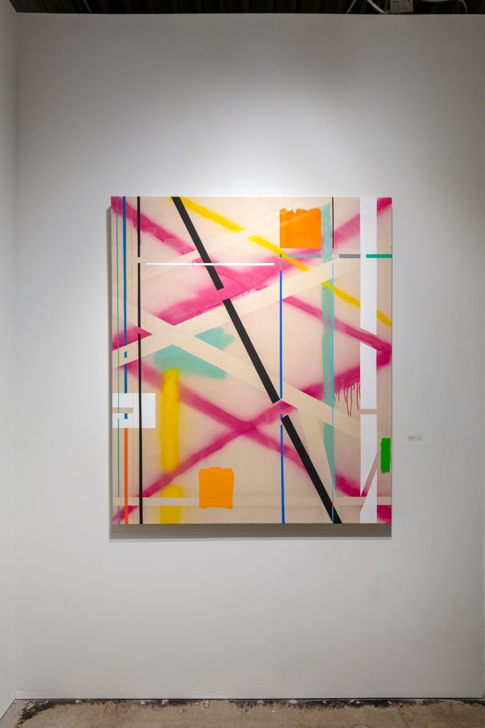
Jeffrey Glossip’s “2018.14” and “2022.2” are composed of lines and boxes that include glitches of space where they intersect, appear, and then disappear and weave under. The clean lines gird the dripping of other lines—not catching them but giving them a different context. The blurry edges of fuchsia or orange undue the static nature of all their counterparts. These spray-painted minimal yet wide-spanning works allow the lines to take over their canvases, cornesr to corners, sides to sides.
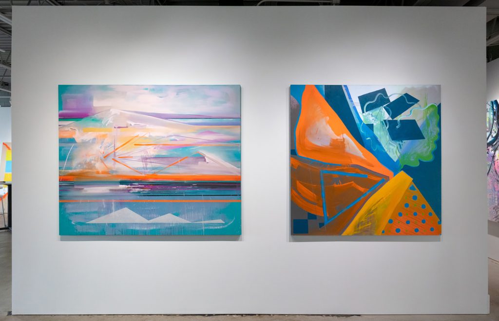
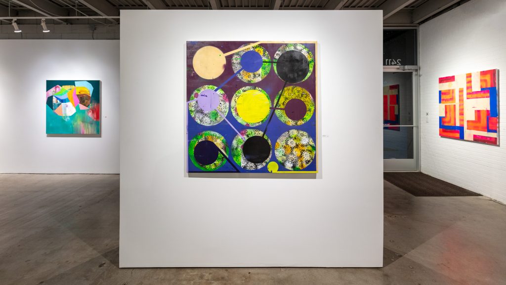
Deborah Zlotsky’s spray paint on canvas large-scale works, “Twilight Zone” and “Spring Cleaning,” feel like a game of Go, being both simple and complex. The former is pink and orange and indigo, and clearly has maze-like paths that lead, until they don’t, and the building blocks the short paths make “L” into each other. The latter is set with circles of different sizes and shapes, set on markers of stenciled flowers. Bold lines connect some of the dots, indicating a swiping or suggested strategy for getting each circle somewhere else. The connecting of the dots in such a raw way invokes a foreshadowing of glide typing. Some of Zlotsky’s bold lines even edge the perimeter of the canvas, though not completely—that would be too neat.
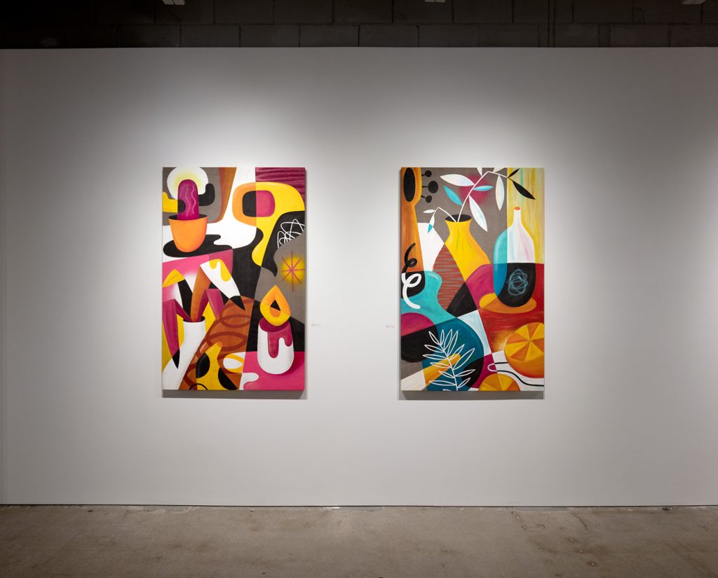
Ruben Sanchez’s paintings “Momentum II” and “Momentum III” are deeply hued vanitas works, fuller than many of his older ones. Smaller in scale but offering multiple scenes, tableaus multiplied to make yet a larger tableau. The magenta, tangerine orange, turquois blue, and golden yellows create—combined with the vases and stems, cactus and guitar—a unique style that is warm and Almodovarian.
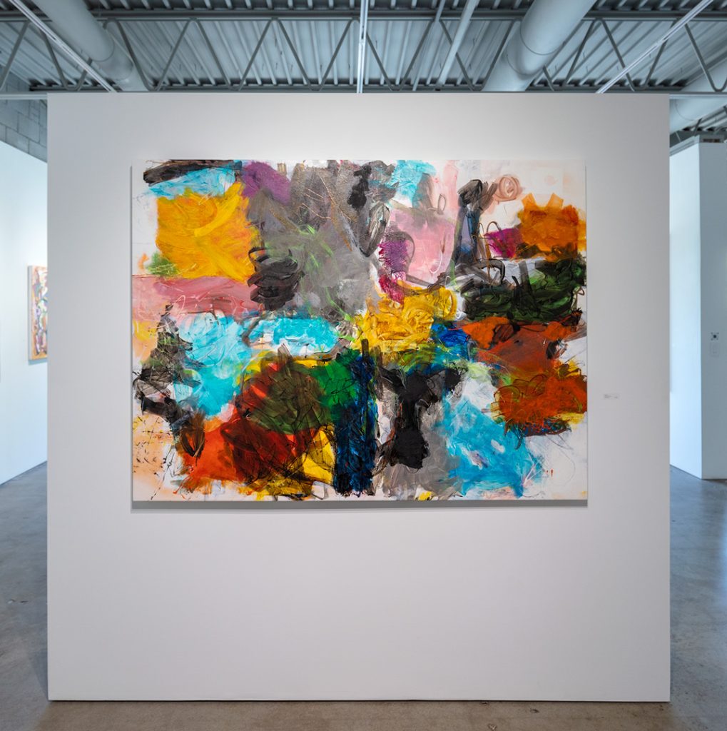
Johanne Brouilette’s two large-scale acrylic paintings feel like floating warriors, fluid tussling, the wrestle more elegant than violent. “Fighting for Freedom” and “Fighting for Freedom II” use black and burnt orange, with white as a translucence, to create shimmering spider-like figures made of slow choreographies.
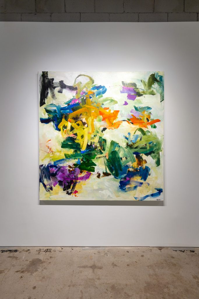
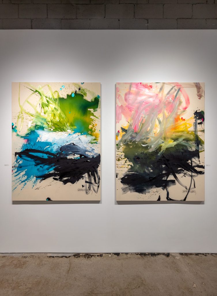
Daniela Schweinsberg’s “Let’s Just Jump in and Forget the World” looks like a document of just that (having happened). The painting captures a joyful abandon that in fact looks like the shadow of a figure having dived into some excitement, splashing around, dancing around and throwing matter around as they go. In contrast, in “Sunset Over the Pond,” Schweinsberg uses the same intense strokes but manages to get a softer evocation, where black water and pink sun meet, and the lake reaches up for the setting glow.
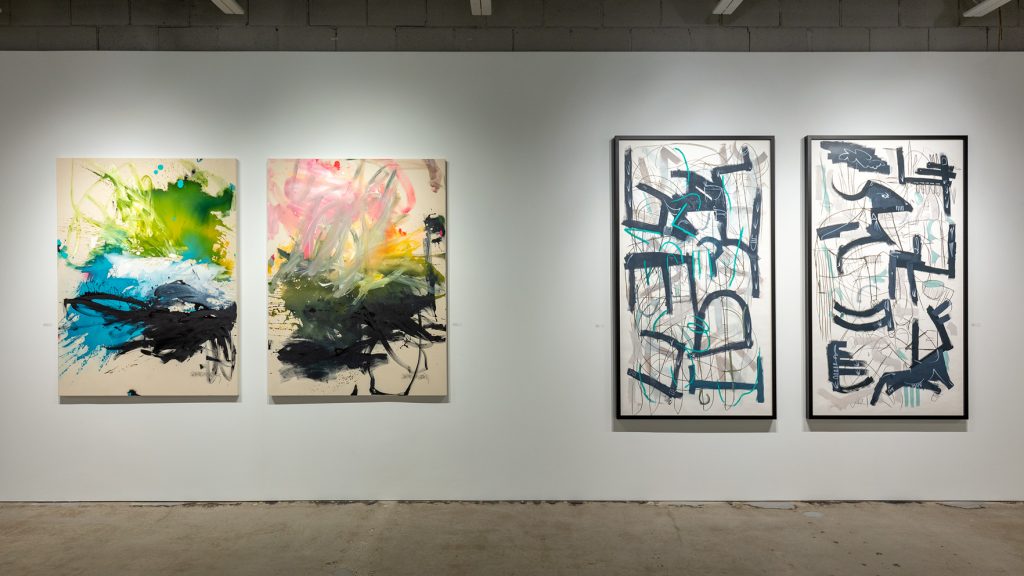
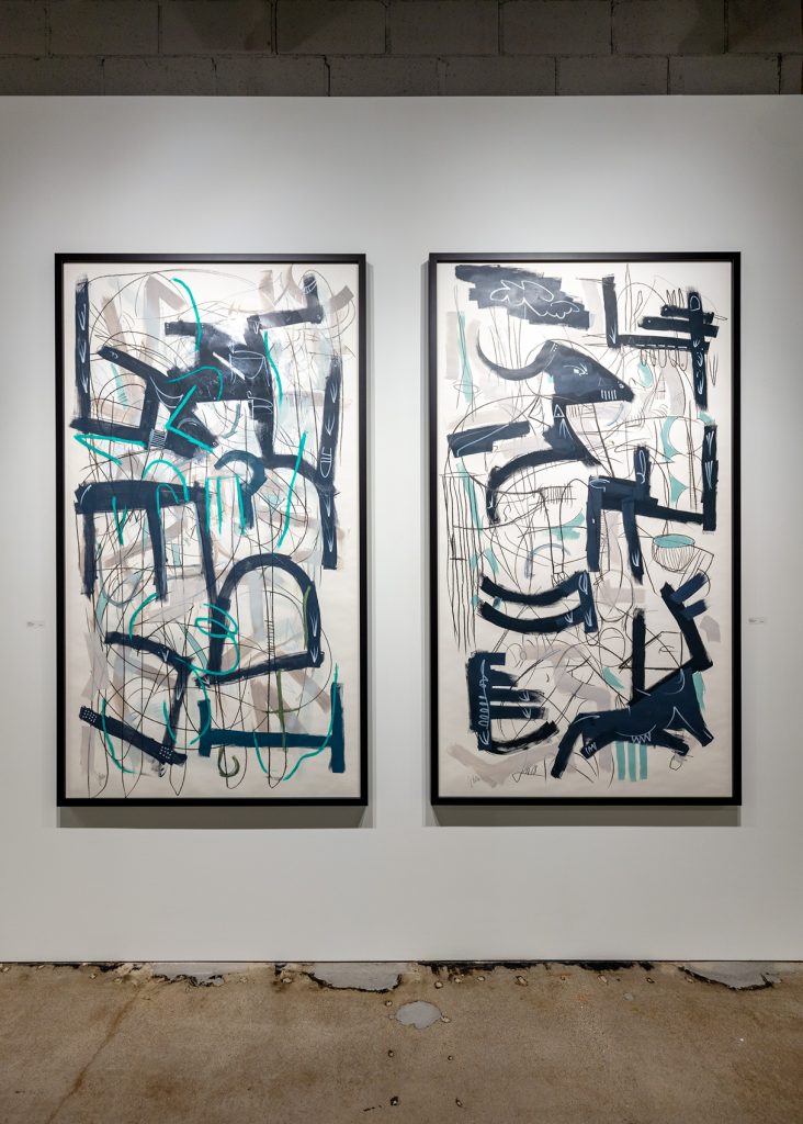
Justin Beller’s “Navigate 1” and “Navigate 2” are vertical dis-assemblages with moments reminiscent of Picasso’s bull and war-torn scattering in Guernica. Some parts of the acrylic paintings feel whole, some dismembered; other lines seem to be spelling something out, character by character, though the individual legibility does not necessarily lead to forming meaning that can be read. The blues and black and specific object shapes also remind one of mid-century modern wall pieces, spare yet almost kinetic in their composition.
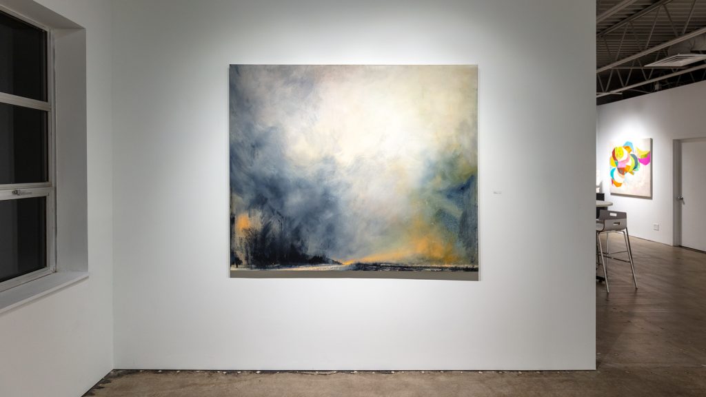
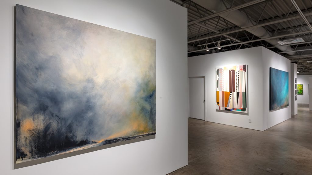
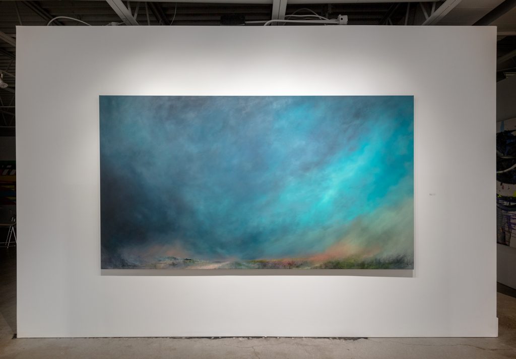
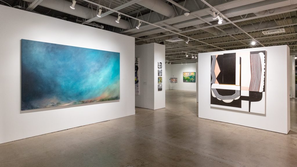
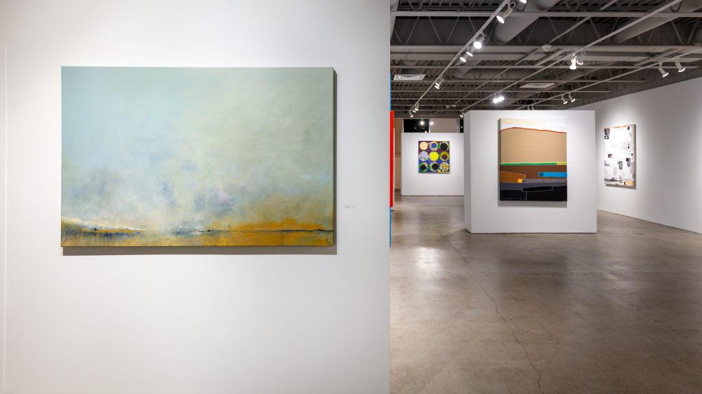
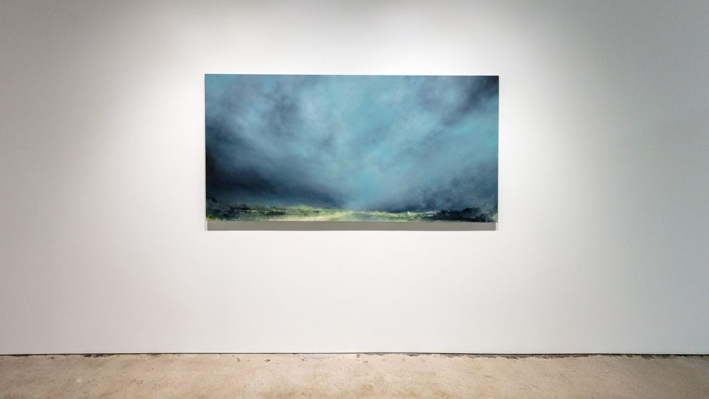
Derrick Briedenthal’s landscapes are translucent—but what do we think we see on the other side? It’s the visibility percentage that amazes the viewer here—horizon spots of lightness—but these landscapes are mostly sky, which offer a lost perspective though they feel like there must be vanishing points somewhere, if only the clouds would clear. The haze factor is what make these paintings so embracing, like weather itself. Gloaming or evening storm, morning fog or rain, Briedenthal’s wide open spaces hint at what’s down the road. Even if you can’t yet see it.
Pamela Staker’s “Space and Time” is so perfectly composed, the viewer immediately feels the zero gravity of space, yet also senses the gravitational pull of the V-shaped opening toward which everything appears to move, where three central corner points might meet. The moving squares are reminiscent of the imprisoning mirrors of the Phantom Zone in Superman, adding another dimension to the story. “Stacked Horizons (fireworks)” moves slowly, almost imperceptibly, its Richteresque striations accumulating in blues and purples. They are interrupted by diagonal gestures, creating triangles that rest upon the horizons, as mountains or icebergs melting, breaking apart, sinking.
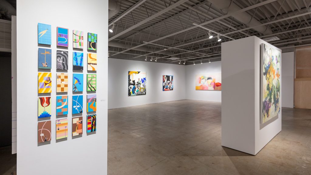
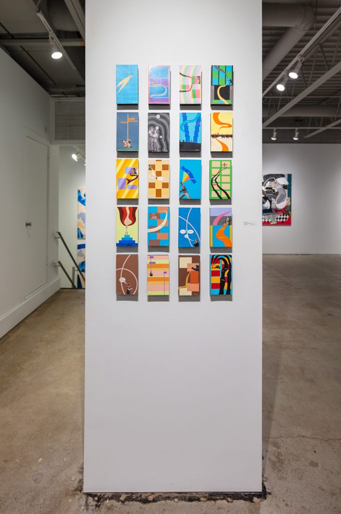
Tibi Chelcea creates mixed-media works with once-new media forms. Much of his work focuses on obsolescence—the technological revolutions that turn and turn, leaving behind discarded VHS tapes in the case of the VCR. These twenty mixed-media erasure poem paintings use the VHS box back to cull new meaning. Painting the small panel to allow a few choice words and images to remain gives leads and character actors a new way to synopsize their story. From Rosalind Russell dressed as a nun to Mandy Patinkin dressed as Spanish swordsmith, the small things that emerge on these small paintings are nostalgic and new, juxtapositions that bring new meaning to old memories. Each box back is adhered to the tape itself, giving it dimensionality.
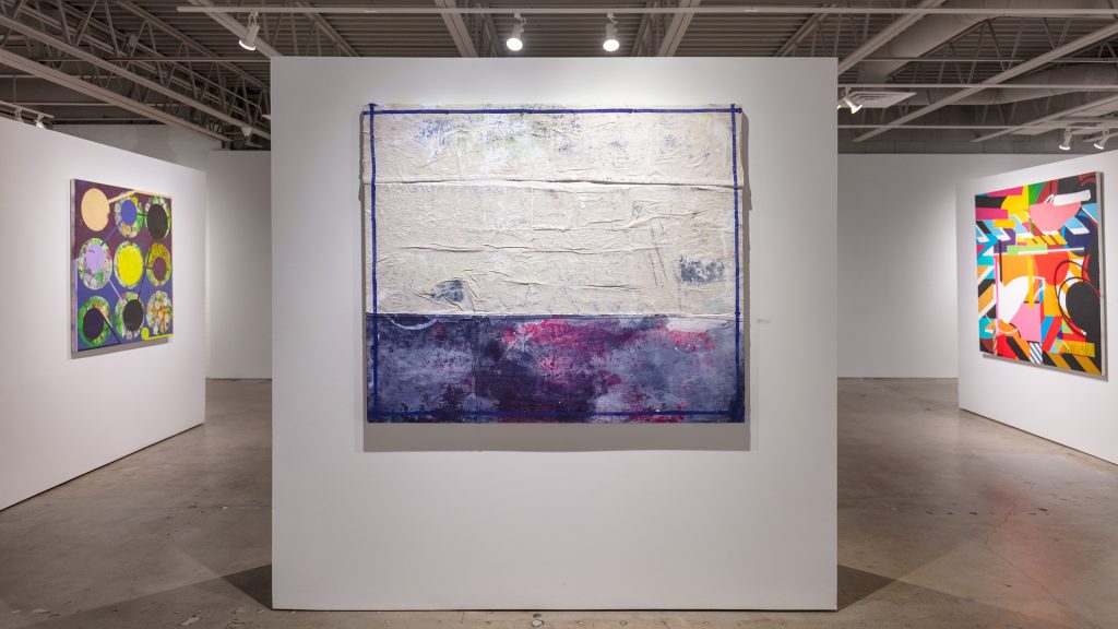
Linda Colletta’s “Half and Half” appears in thirds, two of three that seemingly belong to each other. So where is the rest of those fractions, you ask? All over in off white and blues, framed inside the frame, offering divisions among divisions, but sparingly. “Acid 8000” and “Ocean Size” are more map-like, offering pathways and imprints of shapes such as diamonds and dots. Floor plans with exposed color, blueprints for finding new ways to put things together. These mixed-media paintings are of order married to catawampus-ness, and a search for the fittings for a building of such a coupling.
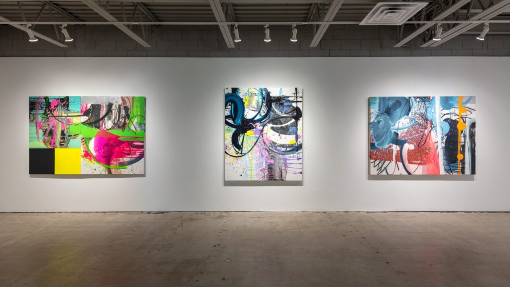
Chuck Hipsher is a painter who eloquently lashes out. His new mixed-media works are tubular, whip smart, with spots and jots, and Baldessarian dots. Crashes of loops, handles of blue, commas and colons and emotional ejecta—these all collide in the most psychological and physical way. Polyptychs are where Hipsher’s at—the joining together of that which does and that which does not engender joy. Wallpaper that belies background calm, white noise on top of visual aurality—his colors and action come from humourism and humor, where rage and compassion ensue. For him, the thinking pendulum is also the beating heart. And so the story goes. And goes. It’s a narrative that will not end even at the edge of a canvas, or panel, or world. Hipsher is keyed in to the interminable, even as he laments the terminability of each of us. We relate. We must. Move. Inside, outside, to and away from each other, with our interiorities vulnerable, exposed.
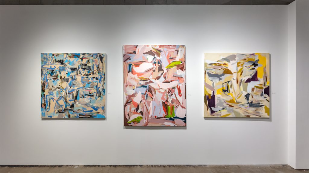
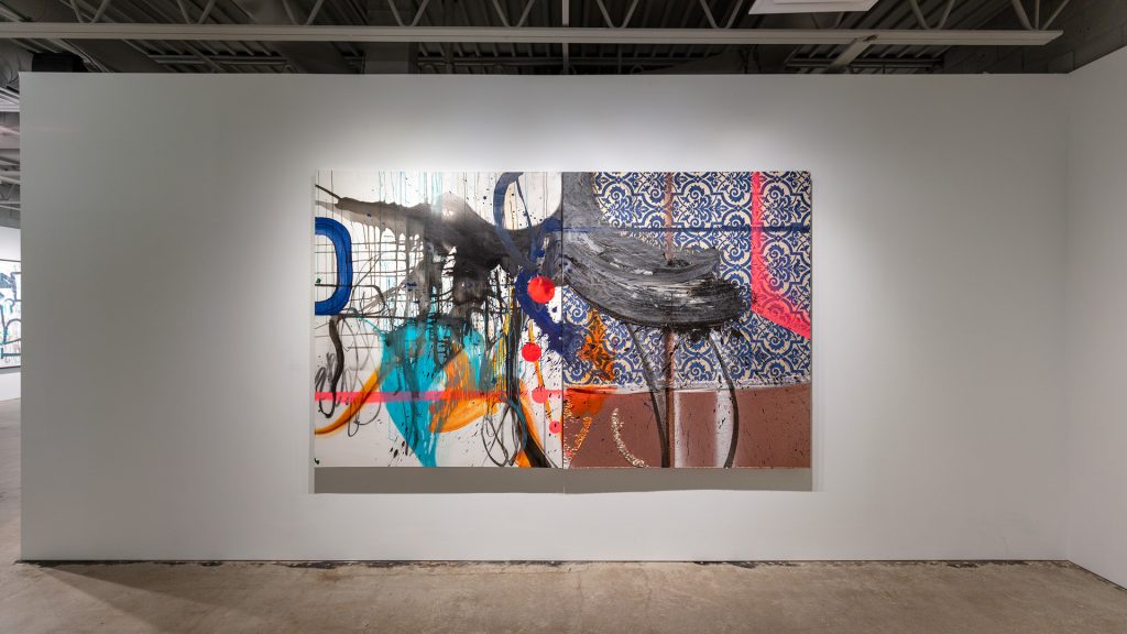
Mazer’s “Static,” a large spray paint on canvas work is anything but static. However, the noise, or disturbed or halted transmission, comes through in the multitude of color and shapes vying for space, creating a cacophony of direction for the eyes of the viewer.
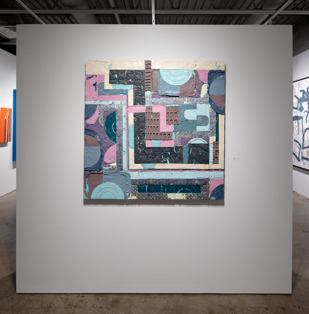
TJ Moberg’s “Flyover Country” and “Hooping and Looping” are collages of latex paint skins. Adhered together to create a subtle layer cake of paint, these large-scale works are playful and very tactile. The former is made of mauve and gray skins, invoking the 1980’s color code which perhaps reached flyover country a little late. The latter is more vibrant, where Moberg uses bolder, vibrant colors to accentuate the many circles, their lost holes nearby, though forever separated from the original circle.
Alyson Khan’s print “Preference for the Myth” is a study in geometric asymmetry as means to balance. The orange, grey-blue, black minimalism, the portal in the shape of what strikes one as the head of a Madonna, tilting—all this evokes calm and entry, whether that be birth or escape, because escape is perceived to be an exit, but the most critical thing about it is entering freedom.
Anita Jung “Drift” and “Screen 3” are loaded acrylic works. Using stencils on panel, the medium and substrates themselves defy easy companionship. Stunning in their Agnes Martin- like beginnings, the repetition works to endear its shapes to the eye, wanting more and getting more. When the pattern ceases, another begins before the return to the predominant shape. It offers a viewing of joyful anticipation.
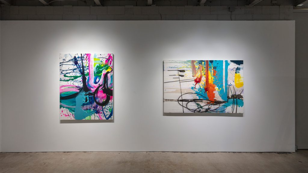
Conn Ryder’s large explosions, “Rode Hard and Put up Wet” and “Shaken, Not Stirred” give off an exuberance that is both light and weighted. Her strokes are wild and aim to escape the frame of the canvas. The whole body feels these works, just as it seems that her whole body created them. They are action stories—the riding, the shaking. They mesmerize so the viewer stays centered in front of them, and the movement they present is indelible.
The painting “Suffusion,” by Leon Hodes, is a canvas as palette itself. Turbulence and swirling butt up against more subdued areas of concentrated color, and though the action seems volatile, the way each segment comes together gives the painting a cozy sense of neighboring. The thread through the story/painting looks as if a three-dimensional line worked, wormed, or dragged itself through each blue, green, yellow, and orange mass. Sometimes this line leaves black paint; sometimes it appears to take away paint, leaving a ghost trace. Attaching and leaving behind: The very contaminants of living in a world where one is not alone.
Exhibit Images
